A complete personal brand identity, company profile, and digital presence developed for Dr. Asif Naseem, a London-based General Practitioner building a private practice around preventative healthcare.
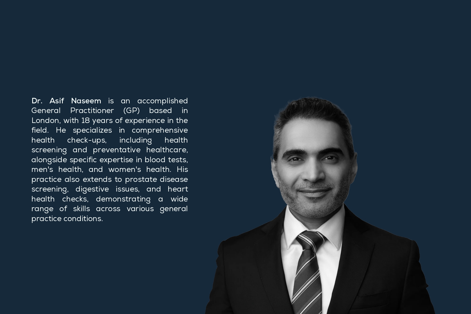
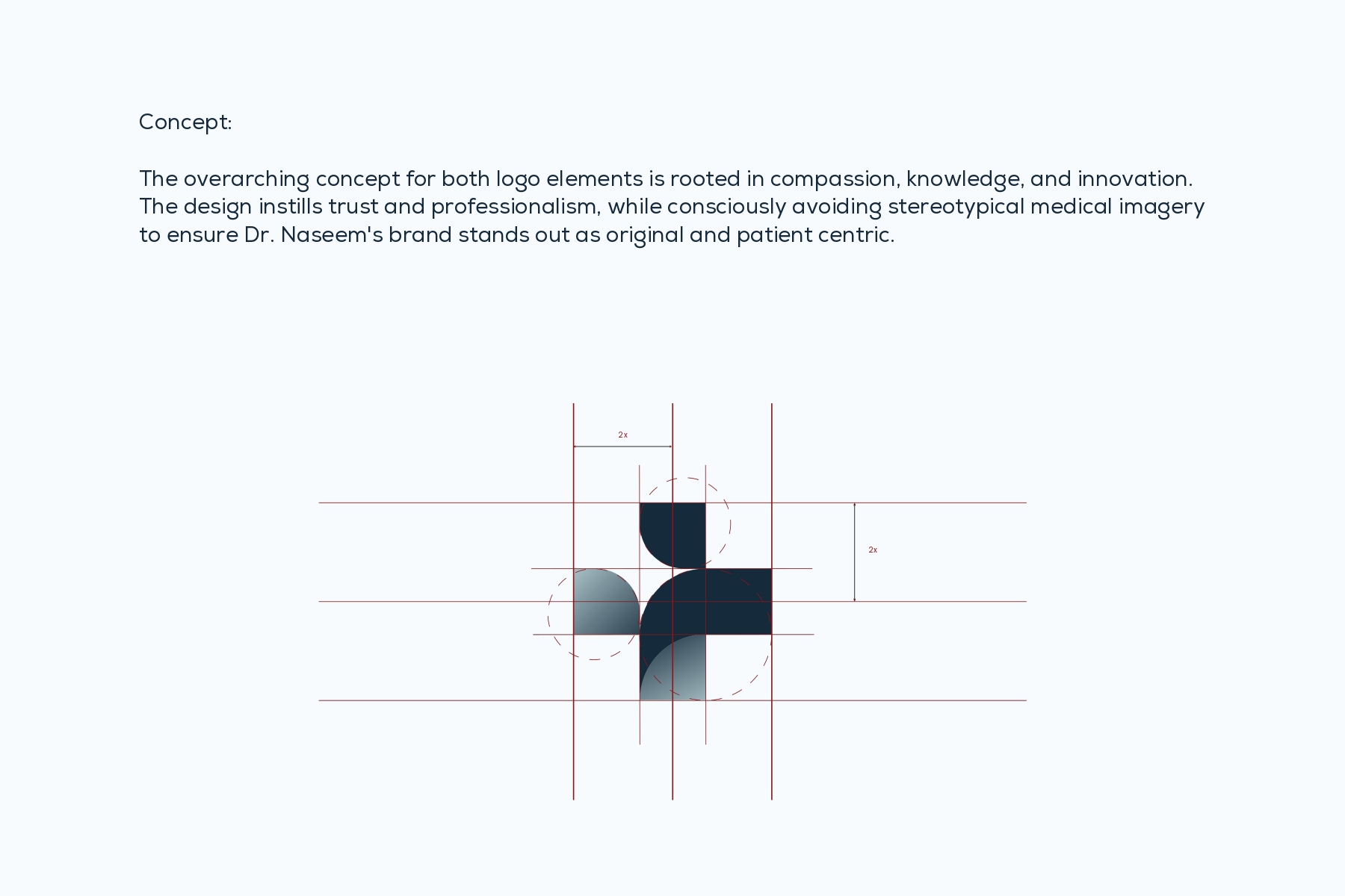
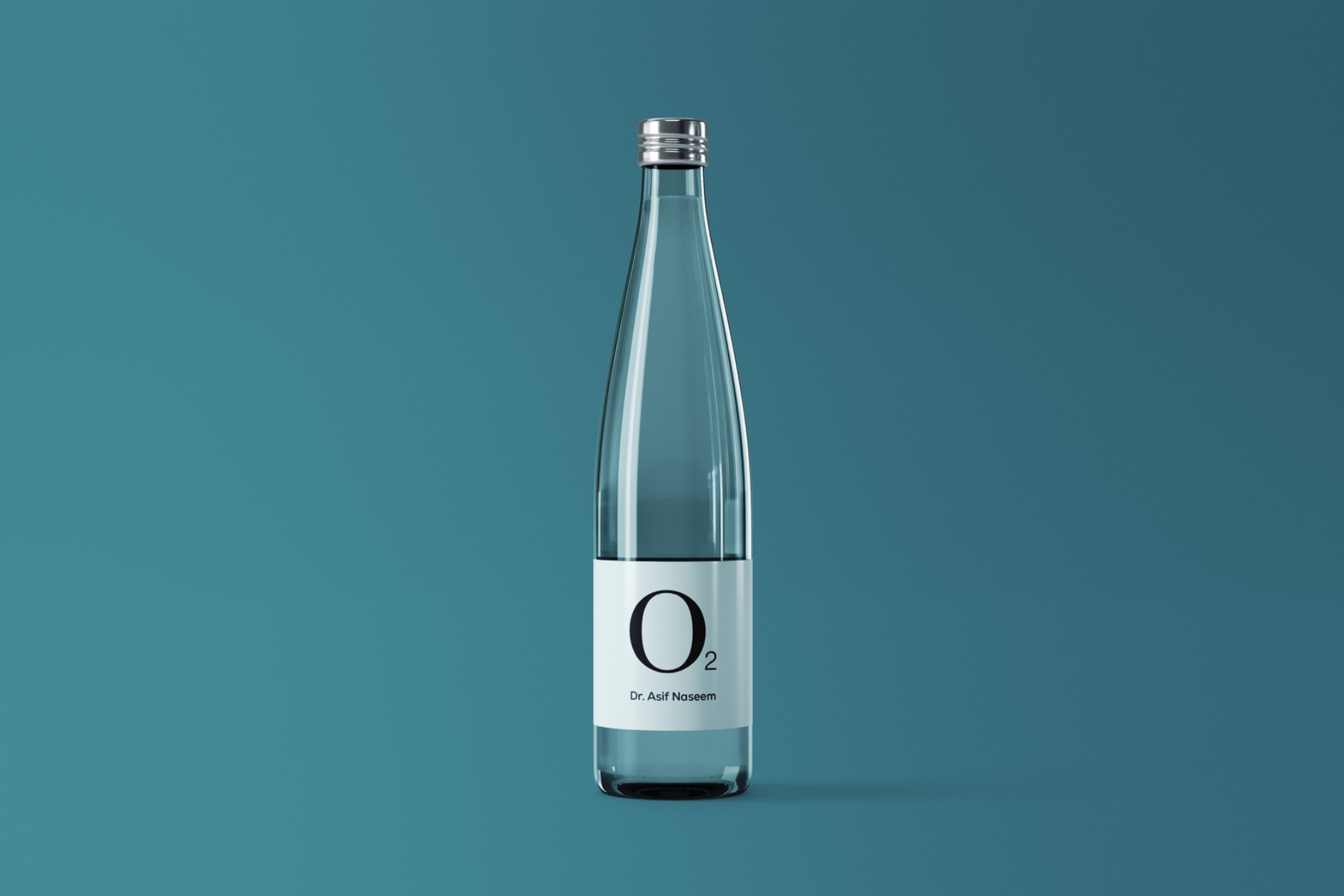
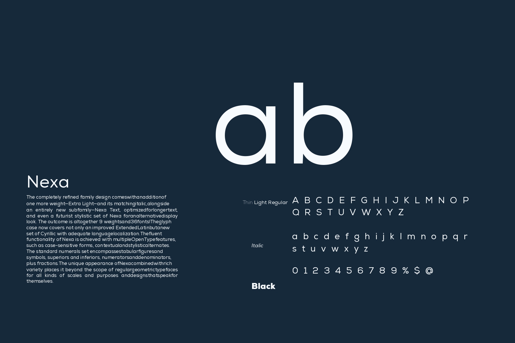
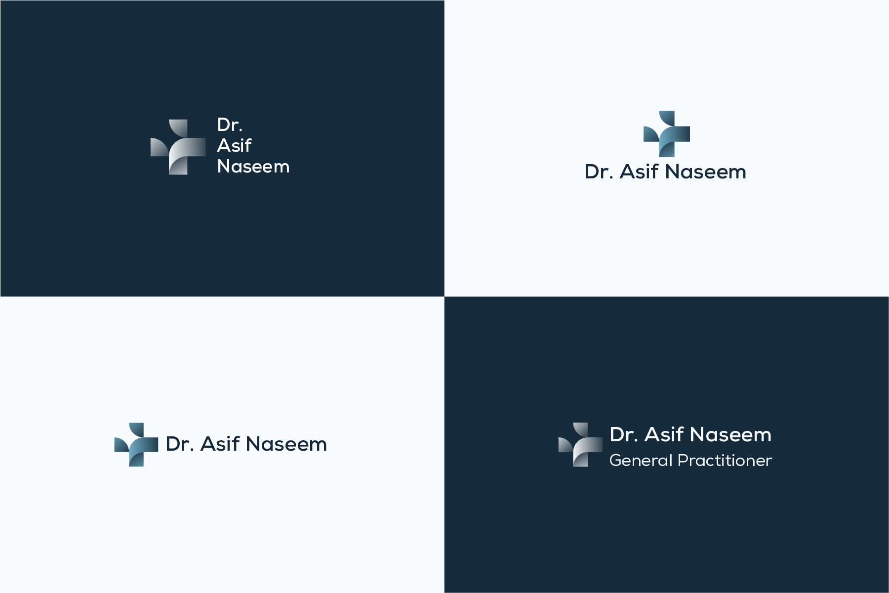
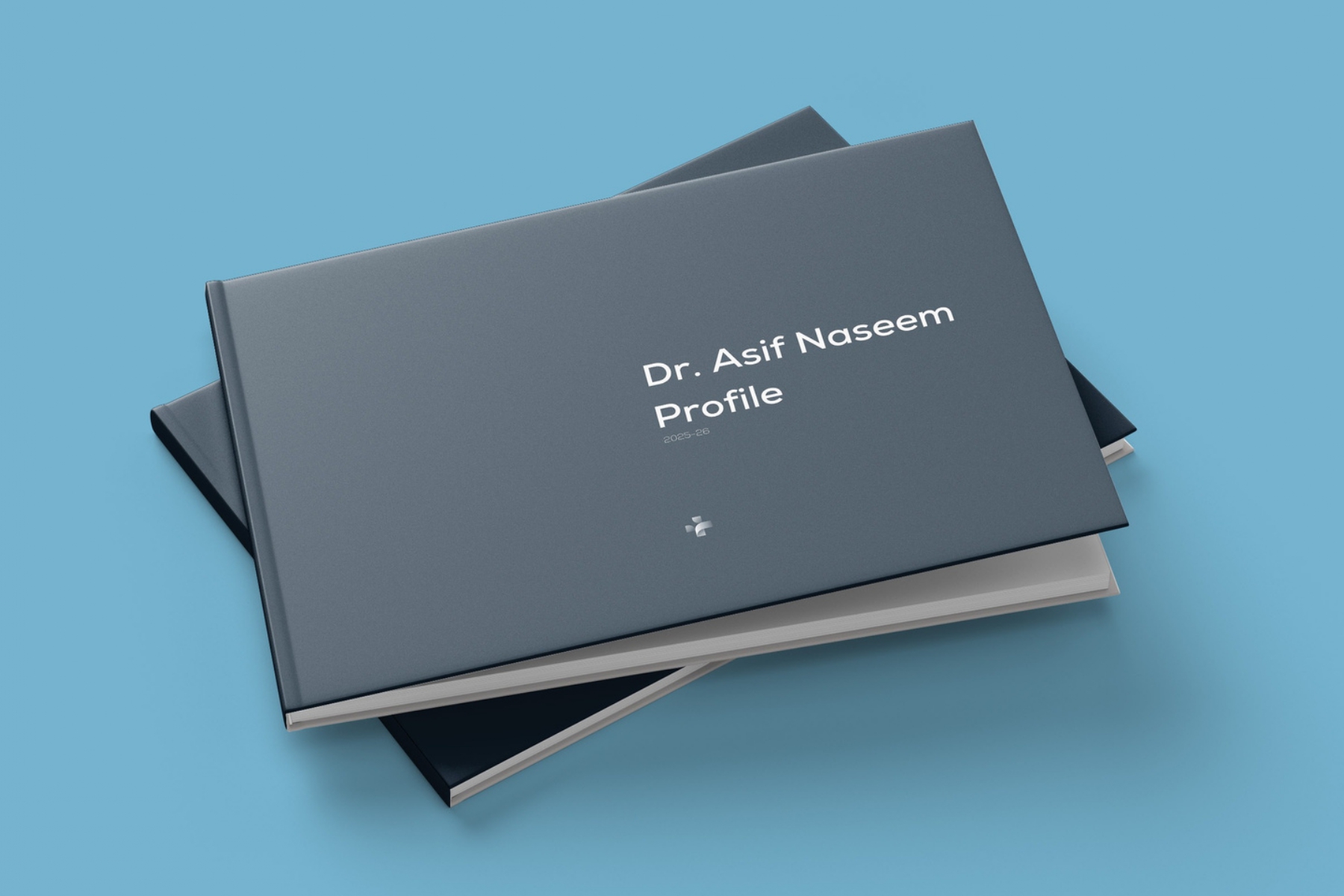
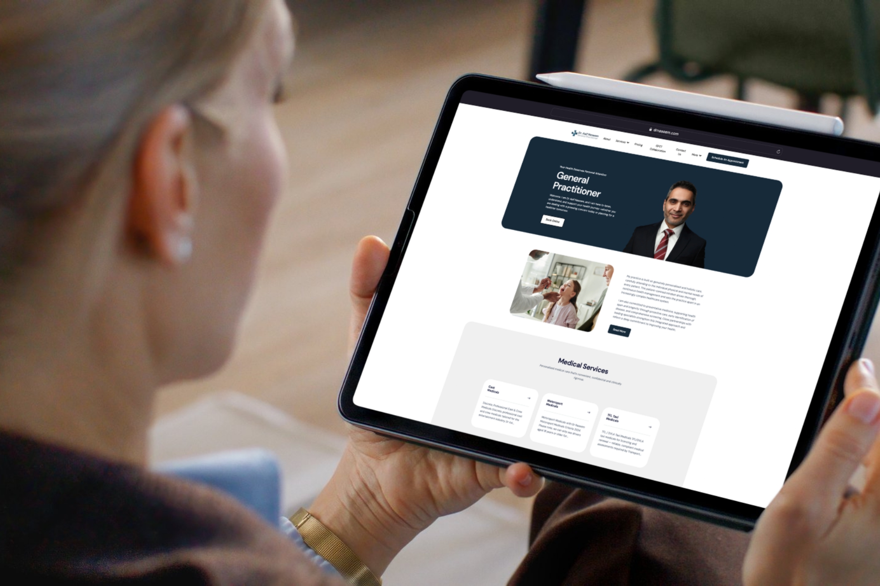
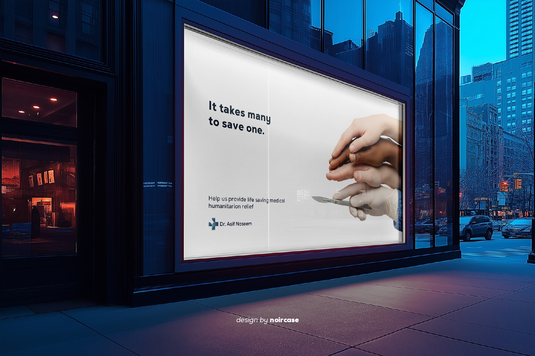
Dr. Asif Naseem is a General Practitioner based in London with eighteen years of clinical experience, specialising in comprehensive health check-ups, preventative healthcare, blood tests, men’s and women’s health, prostate screening, digestive care, and heart health. As his practice moved towards a private, patient-led model, the need became clear: a personal brand that could carry the same authority in a waiting room, on a business card, and on a search results page. Noircase was engaged to build that brand end to end — identity, guidelines, collateral, company profile, and website.The strategic foundation was built on three ideas: compassion, knowledge, and innovation. Rather than defaulting to the visual clichés of the medical category — stethoscopes, heartbeat lines, literal red crosses — the identity was developed to feel personal and human first, clinical second. The result is a mark that reads as a cross at a glance but resolves into something softer on closer inspection: four geometric quadrants, two squared and two rounded, constructed on a strict 2x grid. The rounded forms carry the care; the sharp forms carry the precision. Together they hold the balance that defines the practice.The colour system moves through deep teal and ink navy into pale aqua and white, giving the brand depth without coldness. Nexa was selected as the typeface for its geometric clarity and wide weight range, allowing the identity to shift from confident display headlines to long-form editorial body copy without losing its voice. A full brand guideline was produced covering logo construction, clear space, the four primary lockups, colour values, typographic hierarchy, and a modular pattern system derived from the logo’s quadrants.The identity was then applied across a complete touchpoint system: stationery and business cards, clinic signage, embroidered clinical wear, lanyards and staff ID cards, patient-facing water bottles, and a patterned tote. A hardback company profile was designed as the brand’s flagship editorial piece, carrying the mission statement, practice philosophy, and service offering through a considered layout that positions Dr. Naseem alongside established private healthcare names rather than local practices.Digitally, the brand was extended into a full website and app interface — structured around clear service pathways for private GP consultations, medicals, blood tests, and occupational health screening, with booking treated as the primary action throughout. A campaign concept, It takes many to save one, was developed to carry the brand into out-of-home and awareness work, extending the practice’s voice beyond patient acquisition into the wider conversation around accessible, preventative care.