
Behind the Reimagine: What It Actually Took to Design Noircase's New Identity
News — Sep 14, 2026Discover the honest, behind the scenes story of how Lahore and London based creative studio Noircase crafted its stunning new visual identity. From an early, painful rejection and an intimidating Pentagram benchmark to a breakthrough single line bird mark, this article explores the resilience, teamwork, and meticulous design philosophy that brought the Noircase Reimagine brand to life.
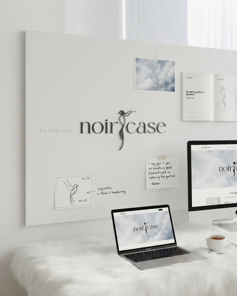
Noircase Reimagine: Behind the Design Story
When people look at the Noircase Reimagine identity today, featuring the single line bird mark, the quiet confidence of the Cloud Dancer background, and the way it scales from a tiny favicon to a full campaign visual without losing its poise, they see a finished system. Clean, minimal, deliberate. What they do not see is the version of this project that got rejected, the moment I thought I could not pull it off, and the slow build from not quite there to a homepage that made our team lead genuinely smile. This is that story.
The Brief: Unique, Professional, Never Messy
From day one, Mr. Naseer Ud Din, who leads our team, was clear about one thing: the identity had to feel like it came from a real design agency, not a template stitched together to look busy. No clutter pretending to be creativity. No decoration standing in for a decision. Just something clean, considered, and genuinely ours.
So I got to work and built the first mockup. I was proud of it. I brought it to Naseer expecting a nod. I got a rejection instead.
The Setback and The Turning Point
That first no hit harder than I expected. I had put real effort into that mockup, and having it turned down made me question whether I had what it took to give this project what it needed. It is one thing to be told a design needs tweaks, but it is another to feel like you missed the mark entirely.
What changed things was not a redesign brief or a mood board. It was Naseer telling me, plainly, to keep my chin up and meaning it. He was not just softening a rejection; he actually believed I could do something better. That kind of trust carries weight.
Then came the moment that really changed my thinking: Naseer sent over a reference from Pentagram, one of the most respected branding studios in the world. Instead of shrinking from it, I treated it as the benchmark to chase. I went back to the fundamentals of the brief: something minimal, something that could hold its own across motion and print, and something with a story behind the mark. That is where the idea of an abstract, single line bird inspired by a founder's sketch and refined into the elegant proportions of a quetzal started to take shape.
The Moment It Clicked
When I finished the homepage design and shared it with the team, Naseer's reaction said everything the rejection had not: I say you — you do something good.
That line has stuck with me. It marked the shift from a design that was fine to one that actually represented what Noircase stands for, bringing clarity out of complexity and craft without noise. None of this happened in isolation. The strength of the Noircase Reimagine identity came from the people around the work: our designers pushing the visual language further, our marketers making sure the identity would actually perform across real campaigns, and Naseer steering the whole thing down the right path.
Looking back, the rejection was not a setback; it was the catalyst that forced the work to get better. Noircase Reimagine is a brand identity and campaign project by Noircase, a creative branding studio based in Lahore and London.