
News / Work · 5 November 2026
One word, seven figures: inside our identity concept for Etihad Hospital
How Naseer Ud Din Ansari and Areeb (Graphic Designer) turned one word, unity, into a bilingual identity concept for a new hospital in Sharjah, in under a week.
The brief arrived as a voice note on 29 December 2024, from a healthcare group in Sharjah. They already ran a busy medical centre with a long list of departments. Now they were building a hospital, under a new name, and they wanted to start properly: a logo, typography and brand guidelines that everything else could be built on later.
The hospital would open with gynaecology, general practice, surgery, ICU and NICU, and add dentistry and dermatology over time. So the identity had a clear job. It had to work on day one, and still make sense when the hospital was twice the size.
Naseer Ud Din Ansari, our creative director, took the brief and worked on it with Areeb, the designer on the project. They started with the name. Etihad means union. It is the idea the UAE was founded on, when seven emirates became one country, and a word people there see every day, from the national airline to the new Etihad Rail. The client had pointed to that himself, and it became the whole idea.
The symbol is seven human figures, one for each emirate, standing around a shared centre with their arms raised. From a distance it reads as a sun. Up close, it is people. We left out everything a hospital logo usually leans on: no cross, no heartbeat line, no stethoscope. A hospital is people looking after people, and the mark says that first.
The name is set in Arabic and English side by side, with equal weight, so neither reads as a translation of the other. A clean medical teal is softened with a warm sand, which keeps the brand calm rather than clinical. Around it, the guidelines work as a system, so a NICU sign today and a dermatology clinic next year follow the same rules and look like one place.
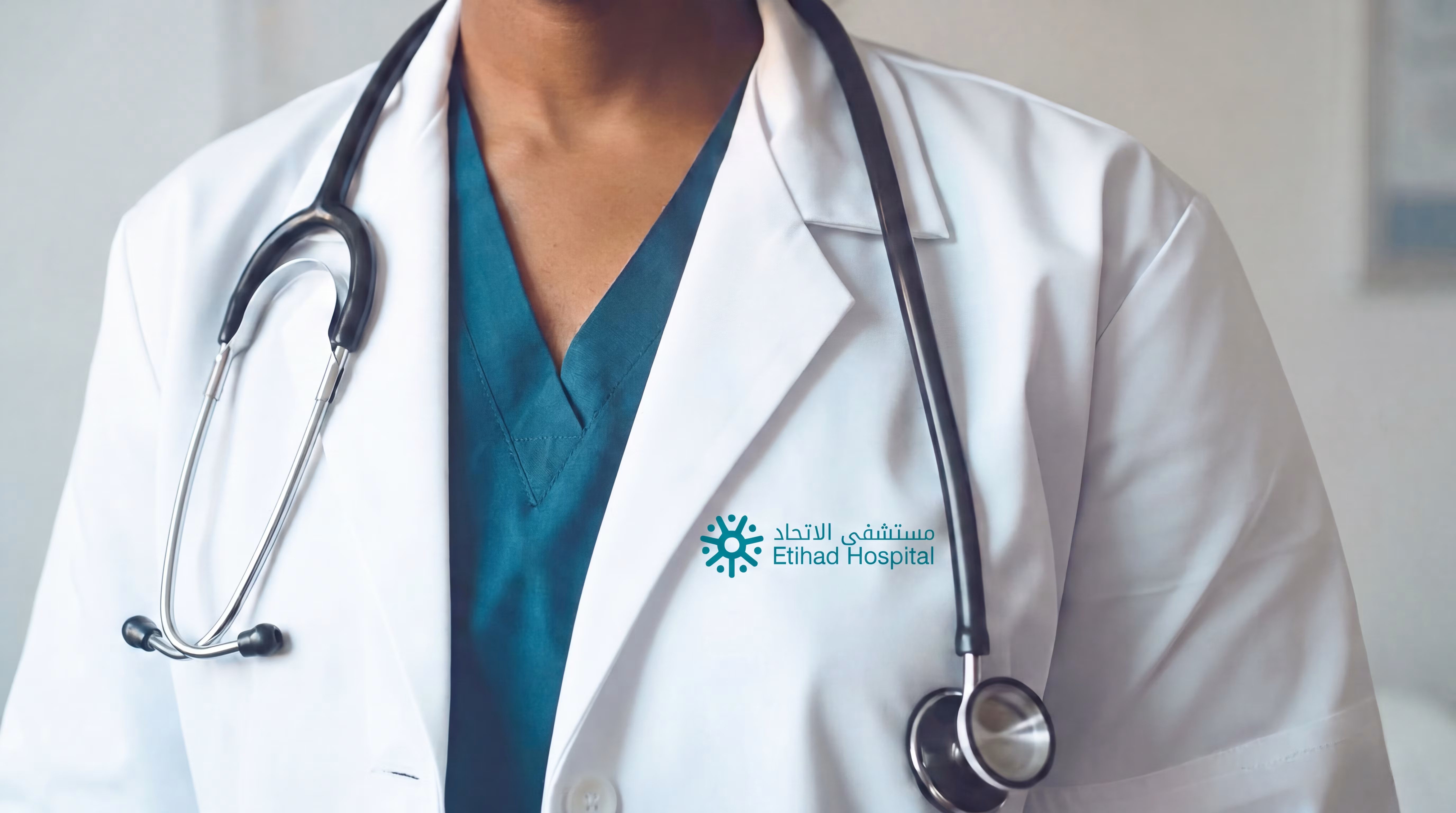
Before sending it, Naseer and Areeb placed the identity where it would actually live: on the front of the building, as an app icon on a phone, and on clinical uniforms. It held its clarity at every size.
The concept went to the client on 2 January 2025, five days after the voice note. It is now part of our portfolio, and you can see the full project on our work page.