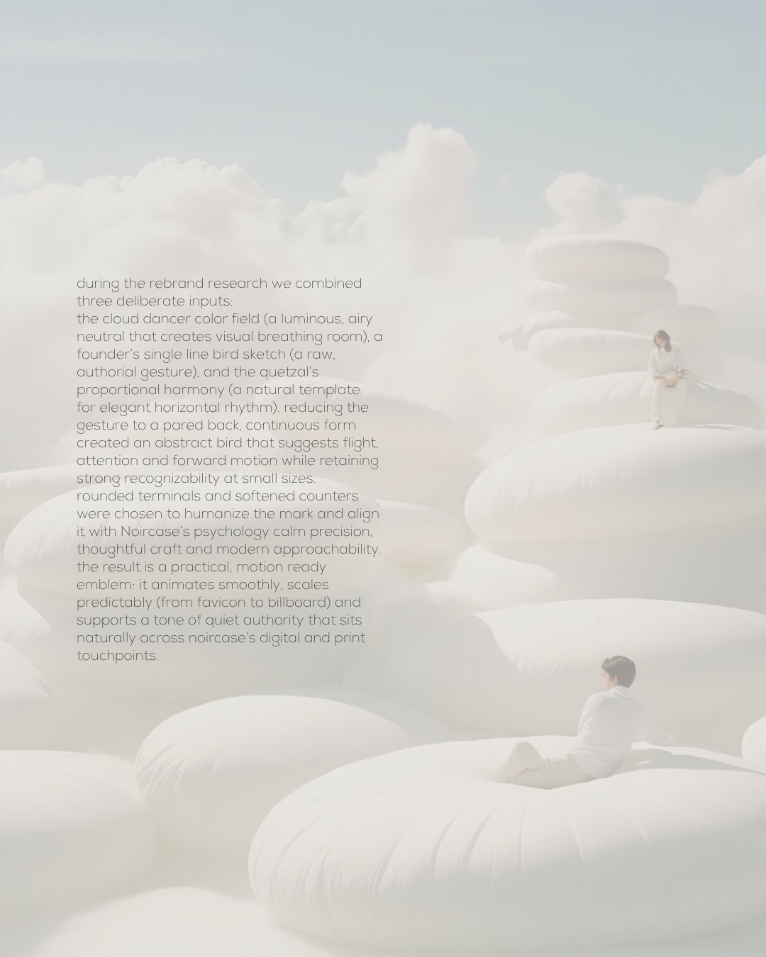
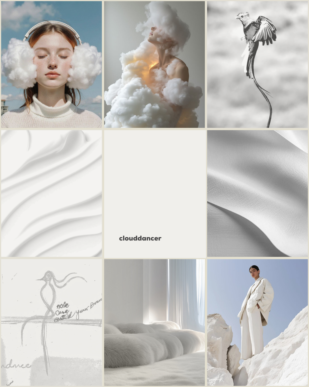
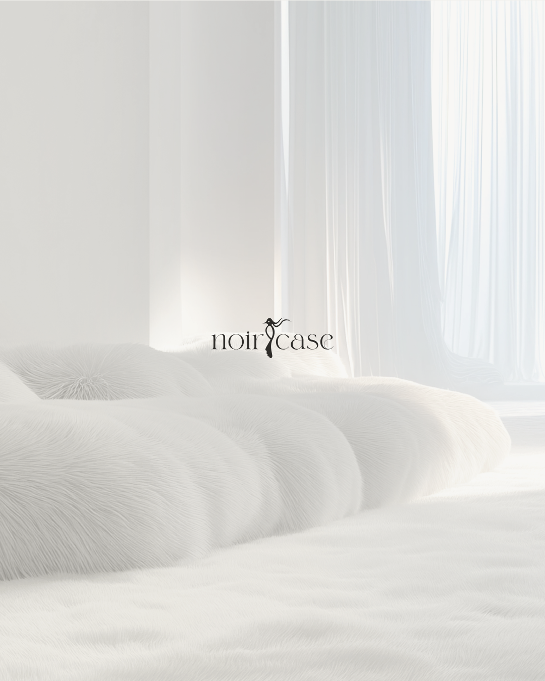
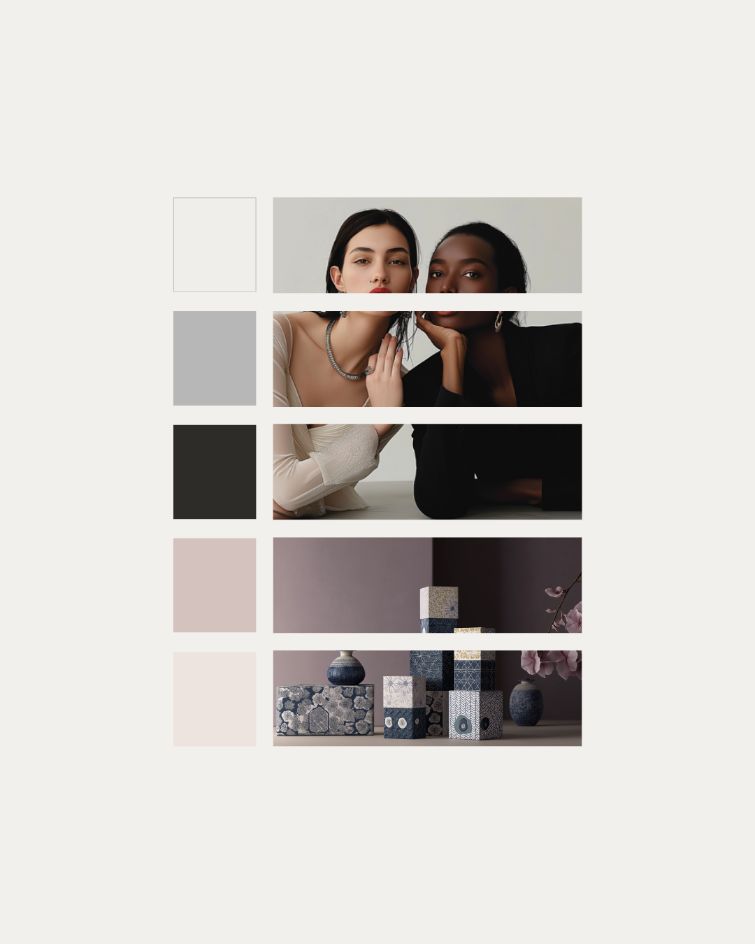
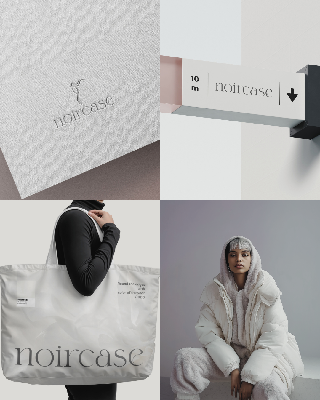
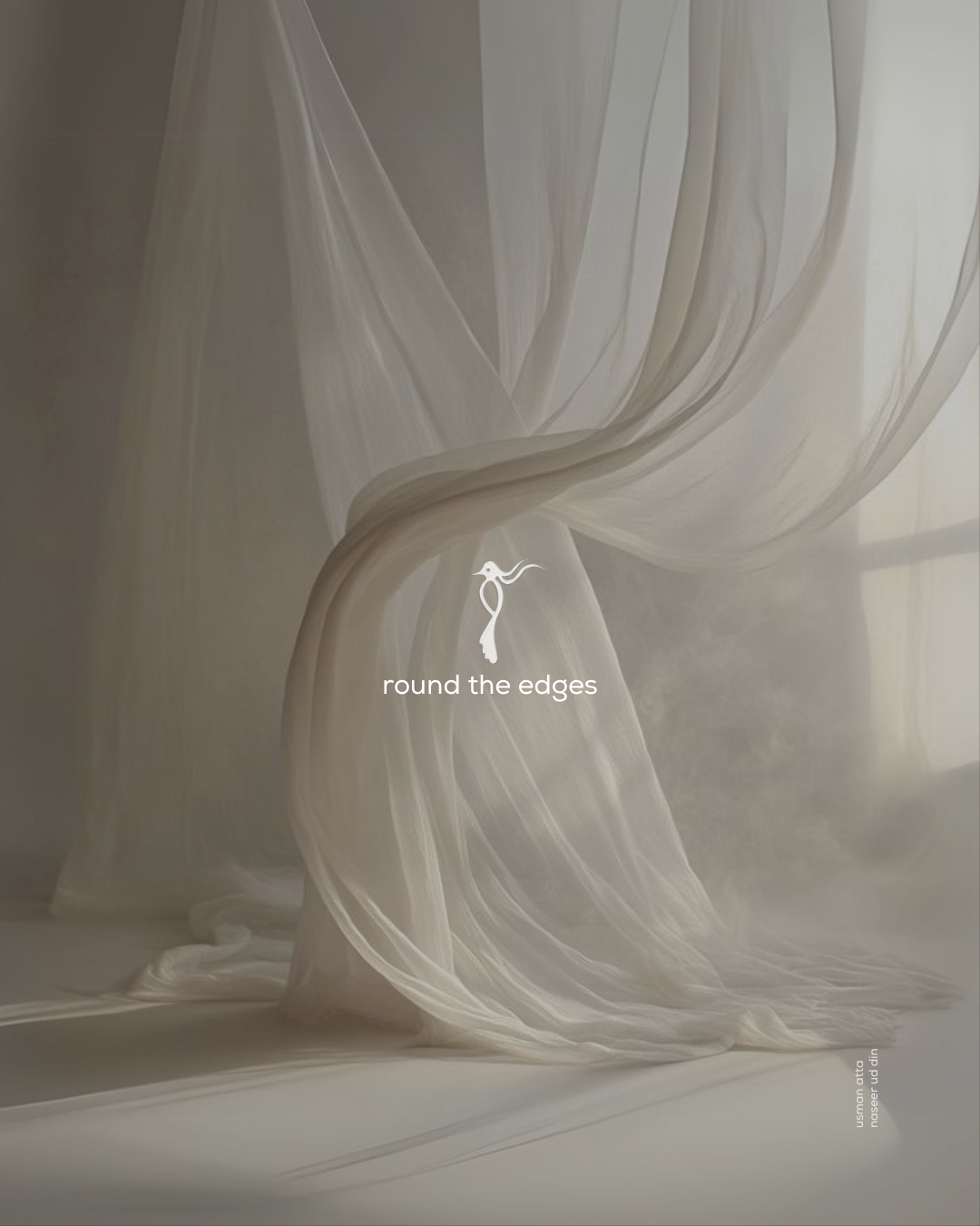
The reimagined Noircase identity is an abstract, single-line bird inspired by a founder’s sketch and refined through the elegant proportions of the quetzal. Set against a Cloud Dancer ground and finished with rounded terminals, the mark balances quiet luxury with purposeful motion. As a minimal emblem of direction, authorship, and craft, it scales seamlessly from favicon to large-format applications while animating with clarity and grace. The luminous off-white backdrop creates space for the identity to breathe, while softened geometry reflects Noircase’s human-centered approach to creative branding, graphic design, and brand identity development. Designed for both motion and print, this visual system communicates precision, composure, and cultural fluency, turning every touchpoint into a clear expression of a modern creative agency.
Sector
- Creative Agency
Discipline
- Brand Identity
- Campaigns