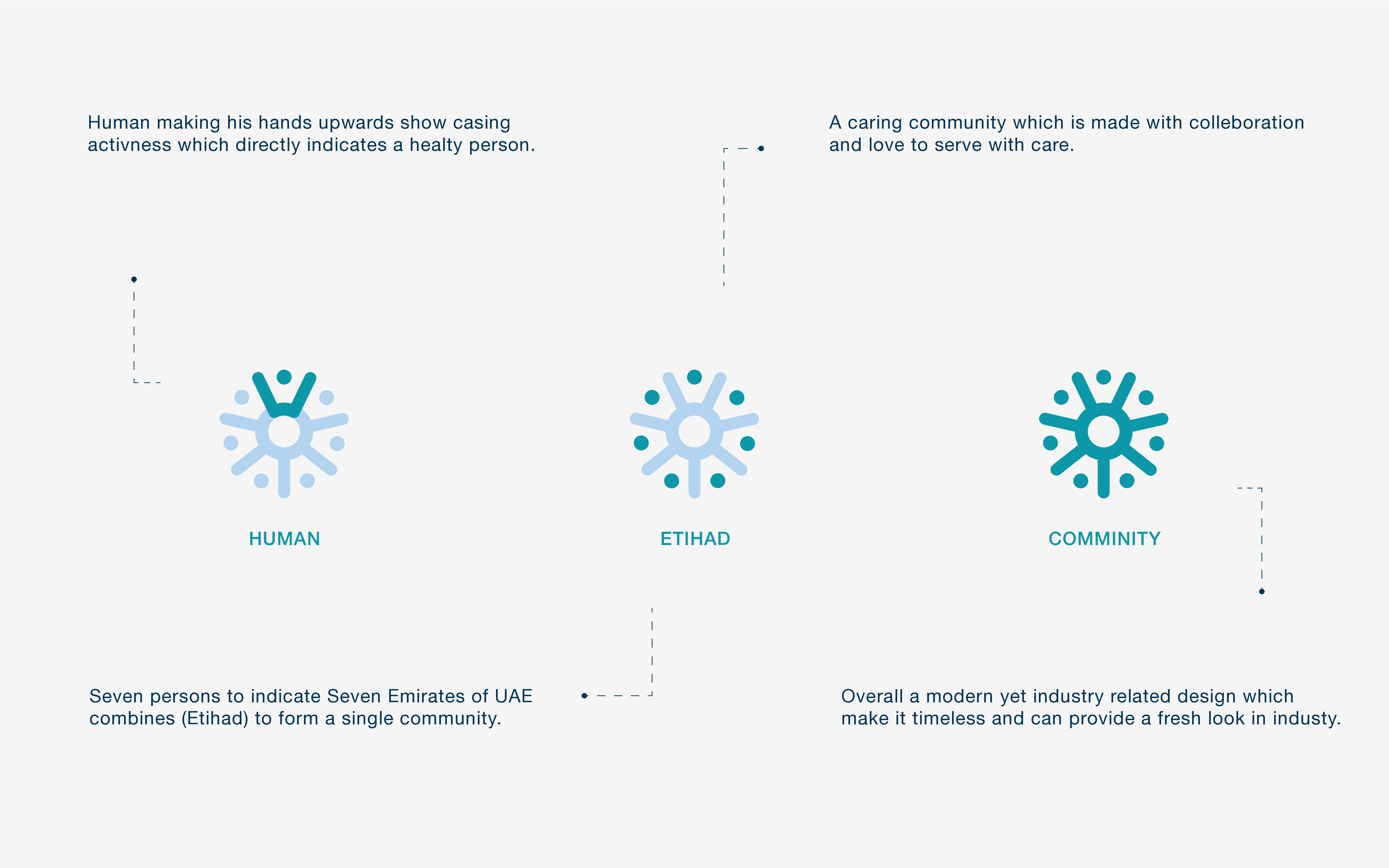
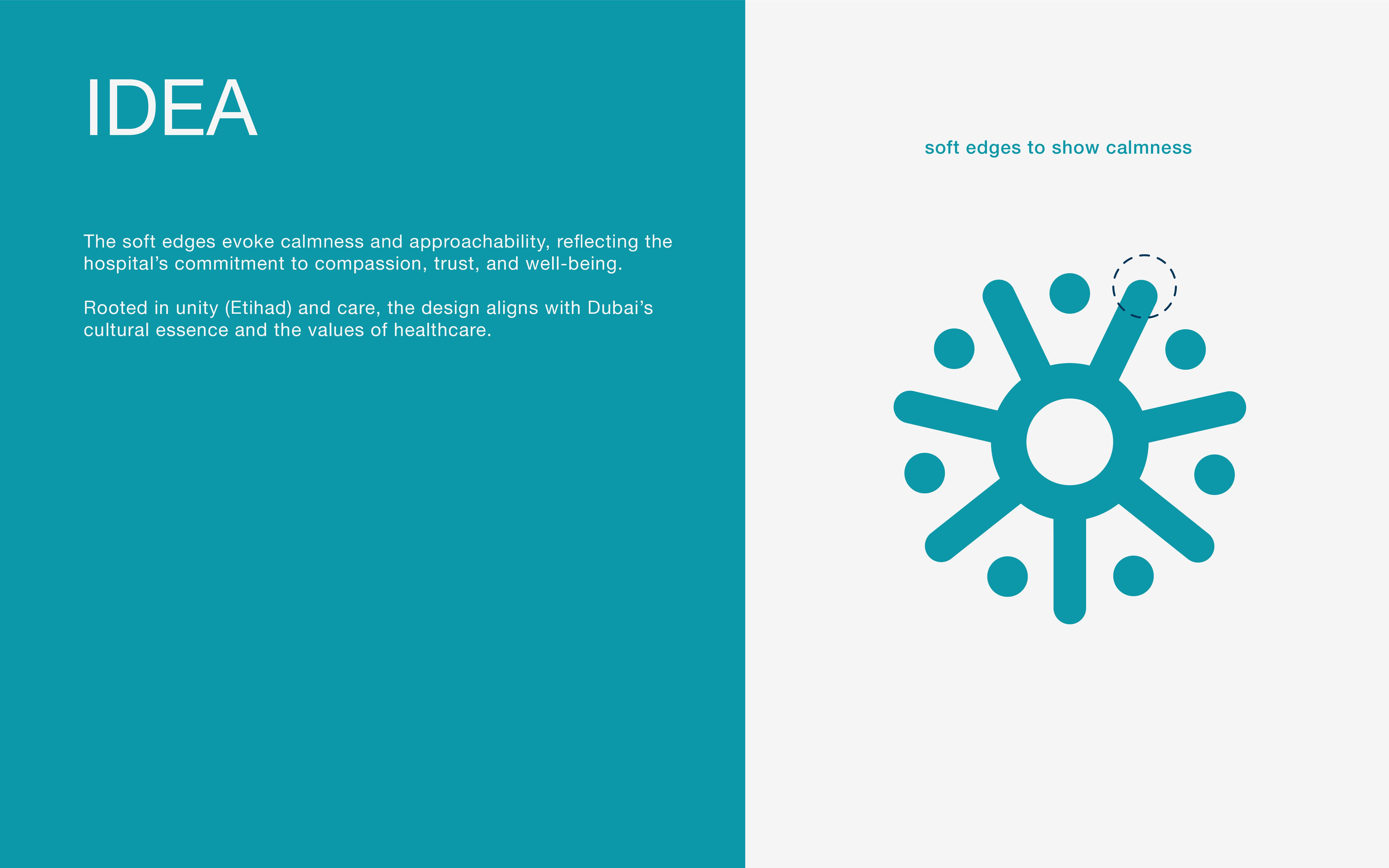
The Etihad Hospital logo design represents more than just a visual mark; it is a symbol of care, compassion, trust, and community. The logo draws inspiration from the concept of unity, much like the 7 Emirates coming together to form the UAE, creating a sense of belonging and support. The design features a stylized human figure with open arms, reflecting a healthy, active person, while the surrounding circular motif symbolizes the interconnectedness and nurturing qualities of healthcare.
The soft edges of the logo evoke calmness, ensuring that the hospital's identity is approachable and reassuring, aligning with its mission to provide a warm, welcoming environment for patients. The design also incorporates symbolic references to the 7 Emirates to express unity, reinforcing the cultural values of Dubai and the UAE.
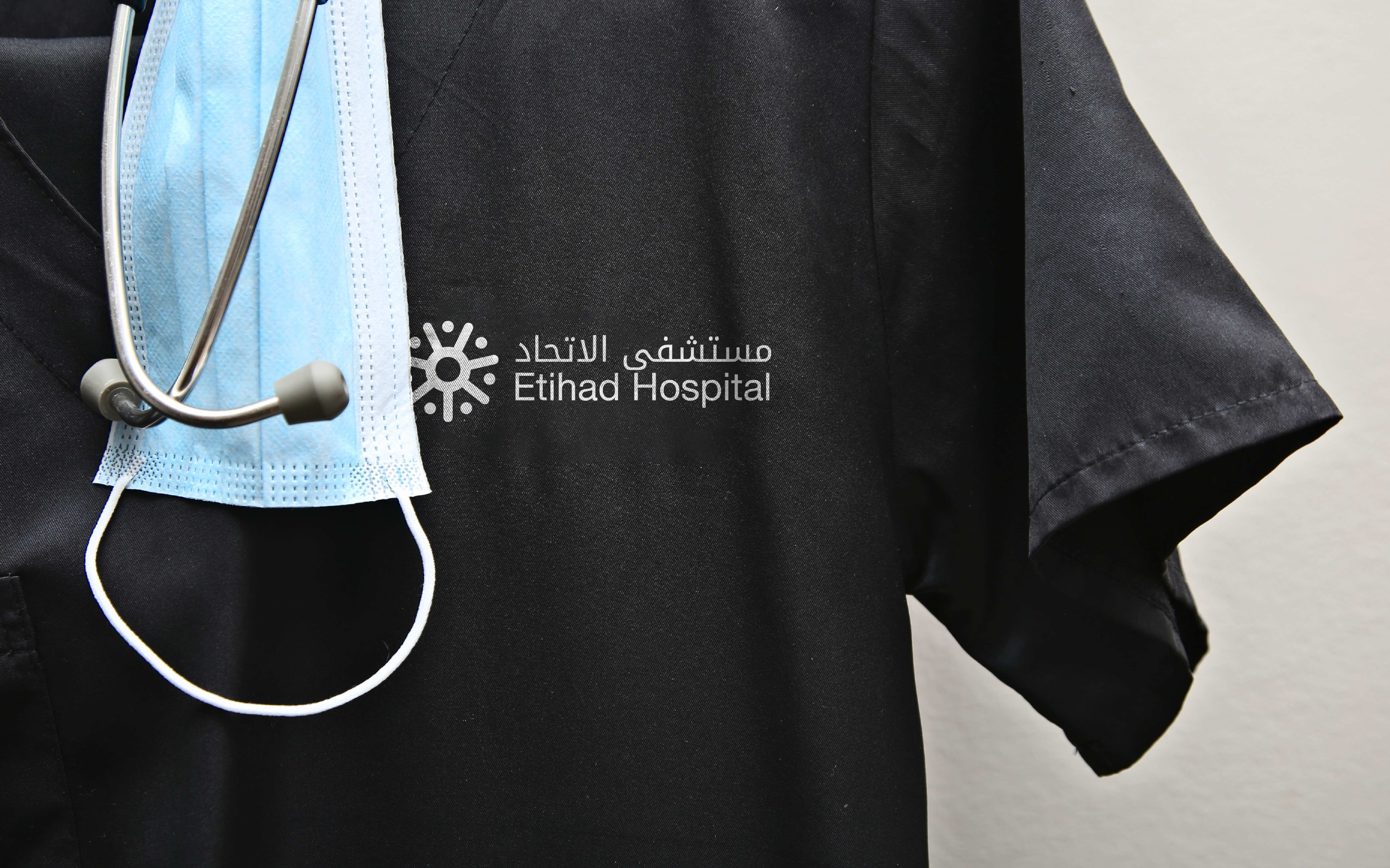
The color palette chosen for this logo is calm and professional, using shades of teal and blue, which are often associated with health, trust, and tranquility. This is complemented by Arabic and English text, ensuring the logo’s cultural relevance while maintaining clarity and impact.
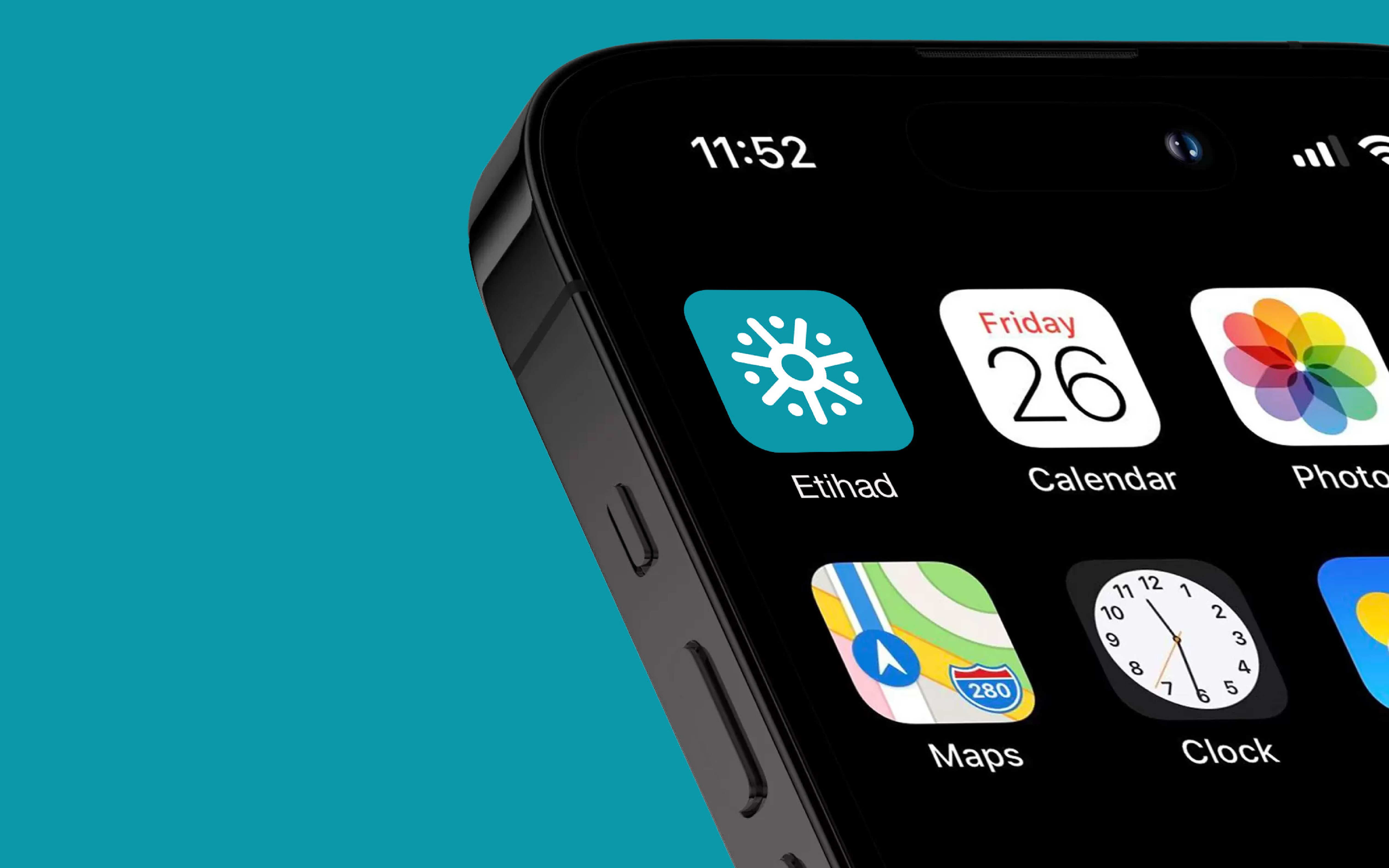
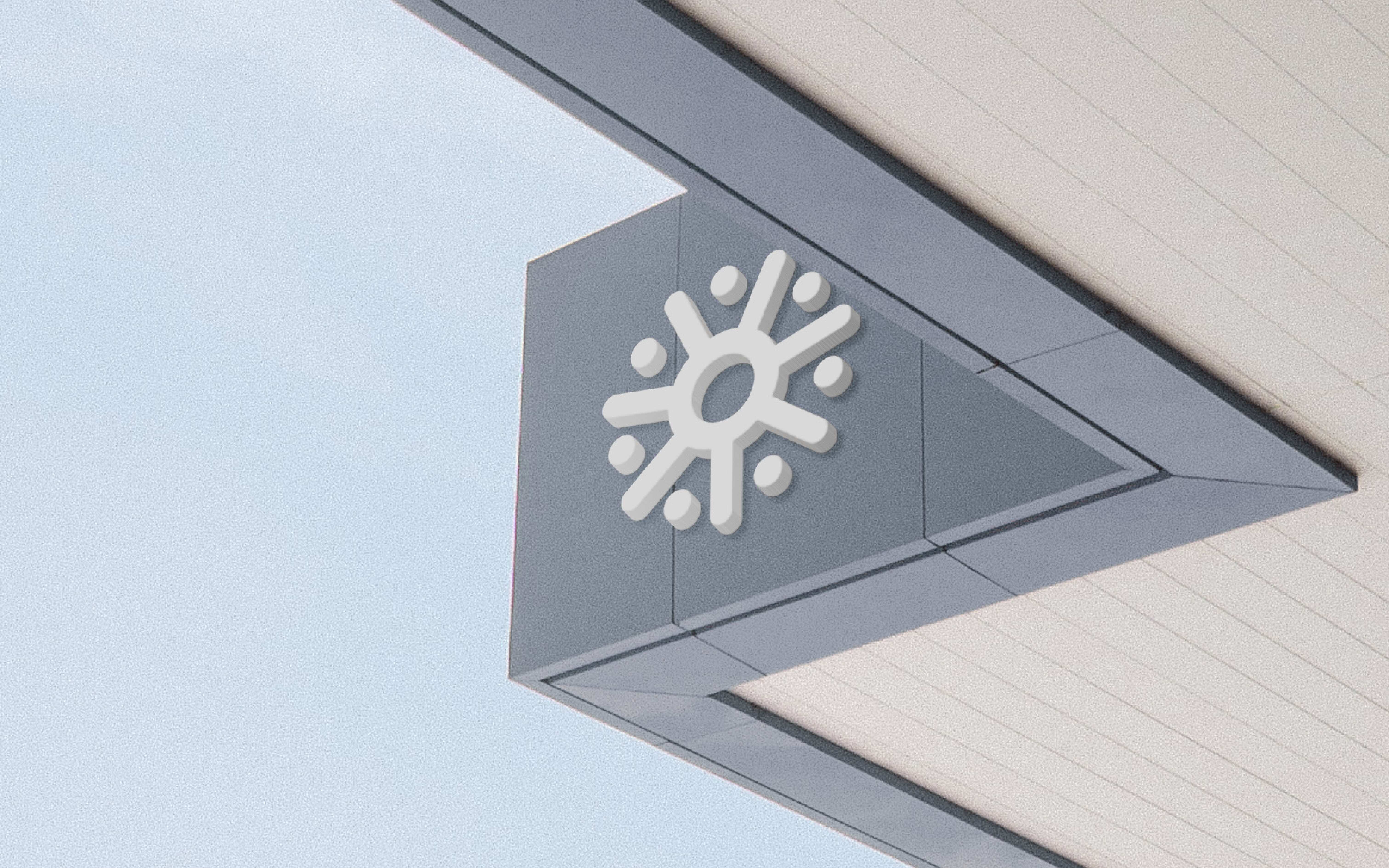
Overall, the Etihad Hospital logo is not only a visual representation of healthcare but also an emblem of unity, trust, and care, designed to make a lasting impression while staying true to the hospital’s values and mission. The logo is adaptable across various media, from digital applications to signage, reflecting the modern and forward-thinking approach of the hospital.
Sector
- Skincare
Discipline
- Packaging
- Brand Identity