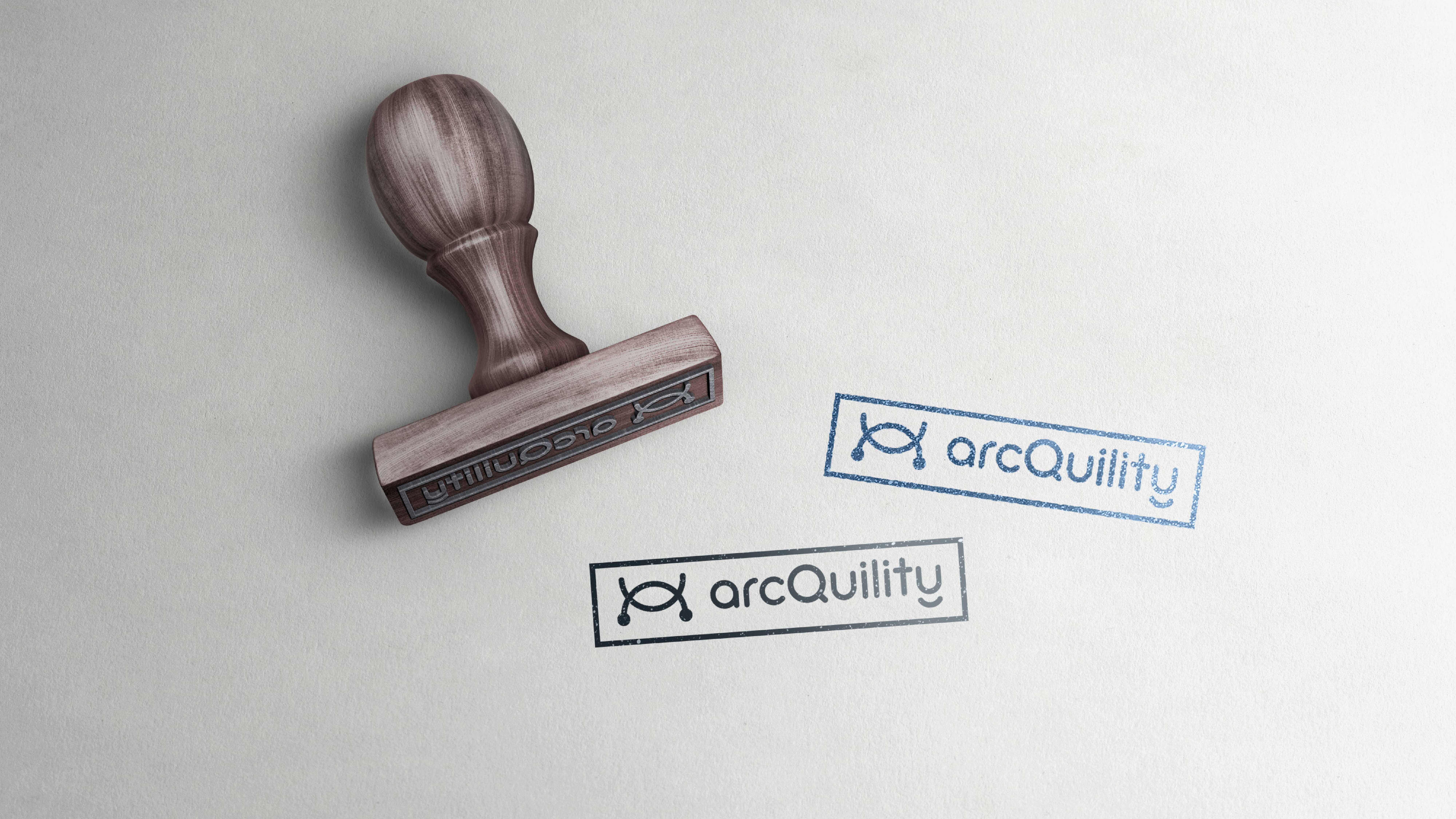
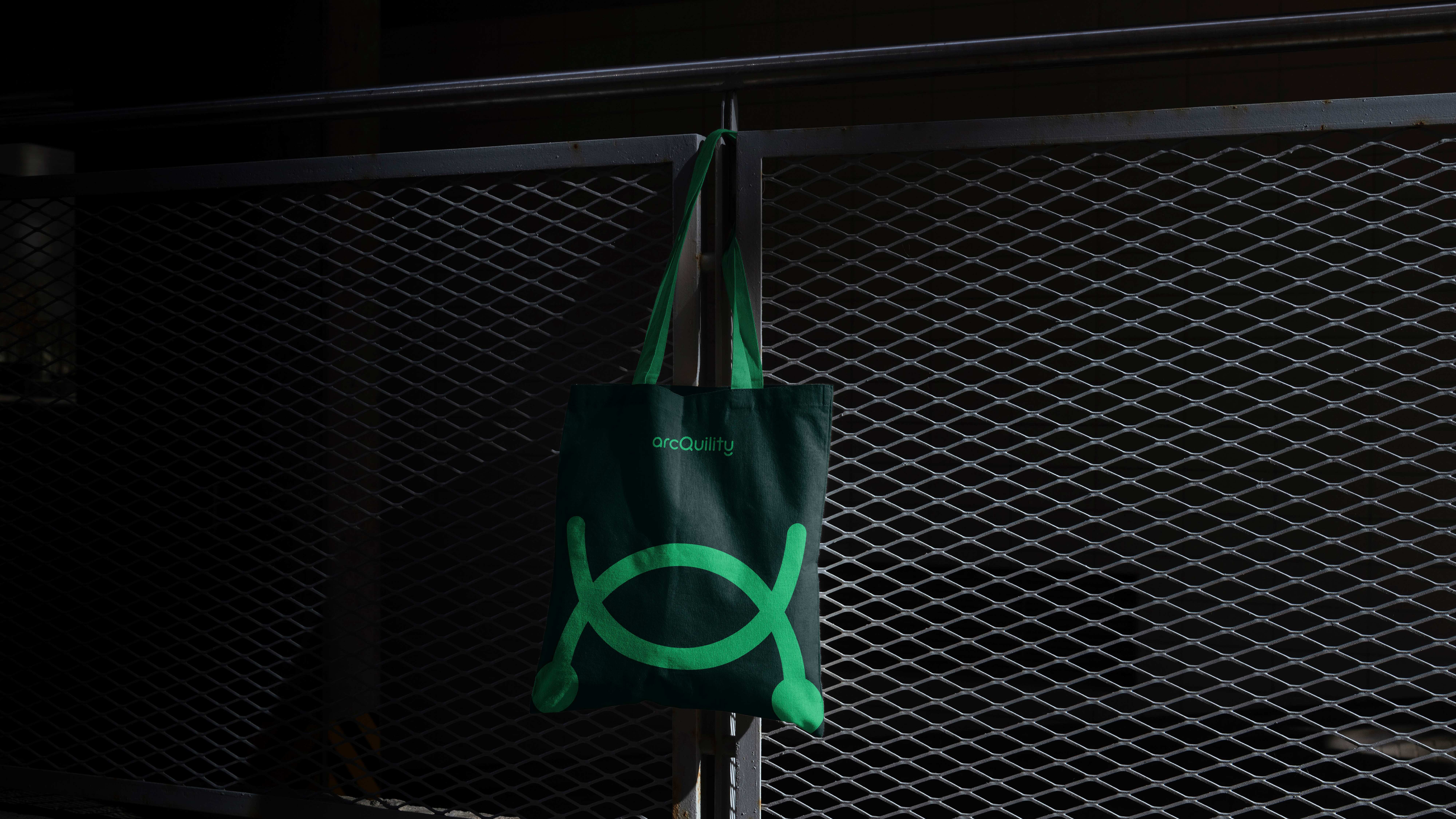
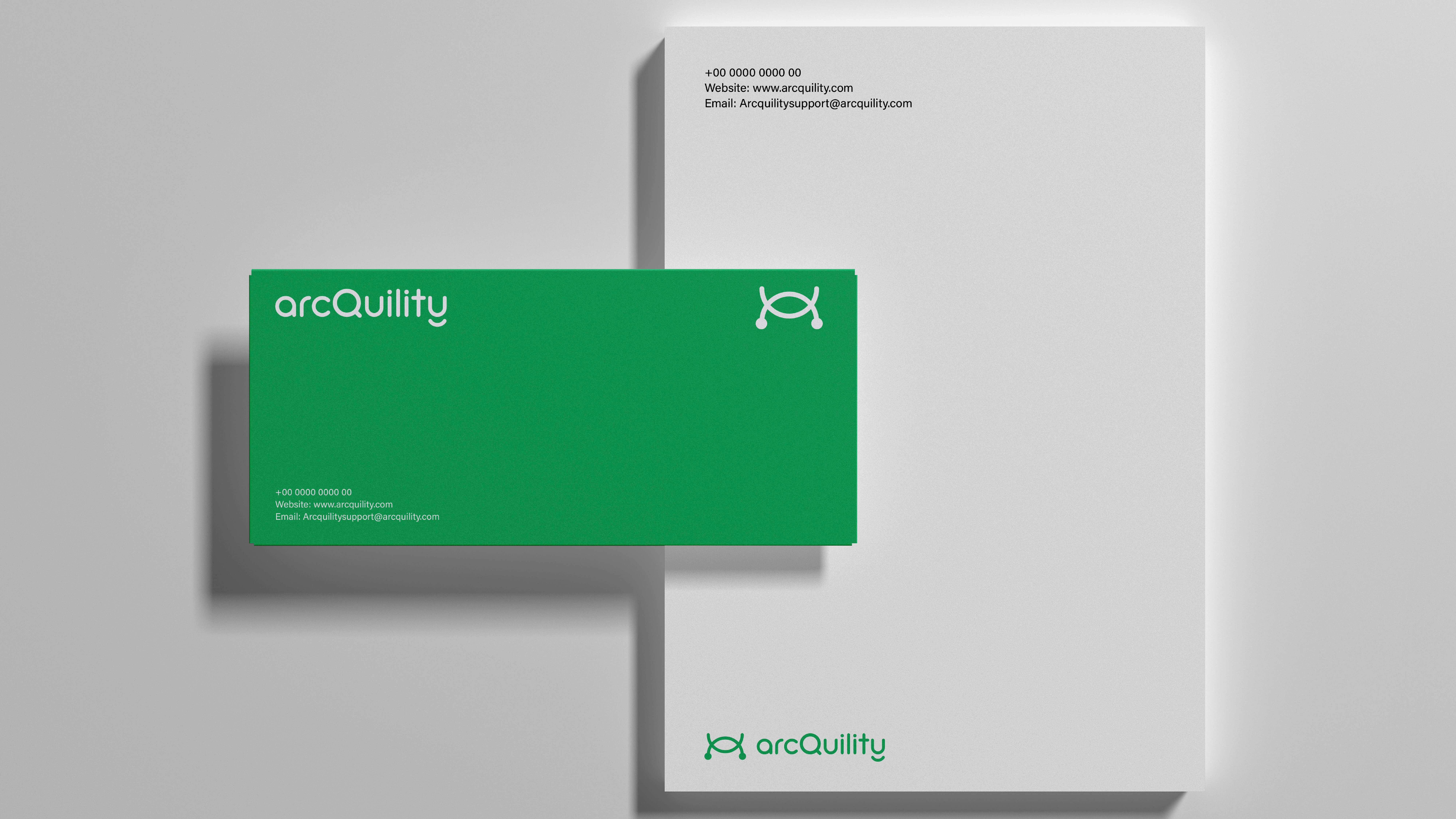
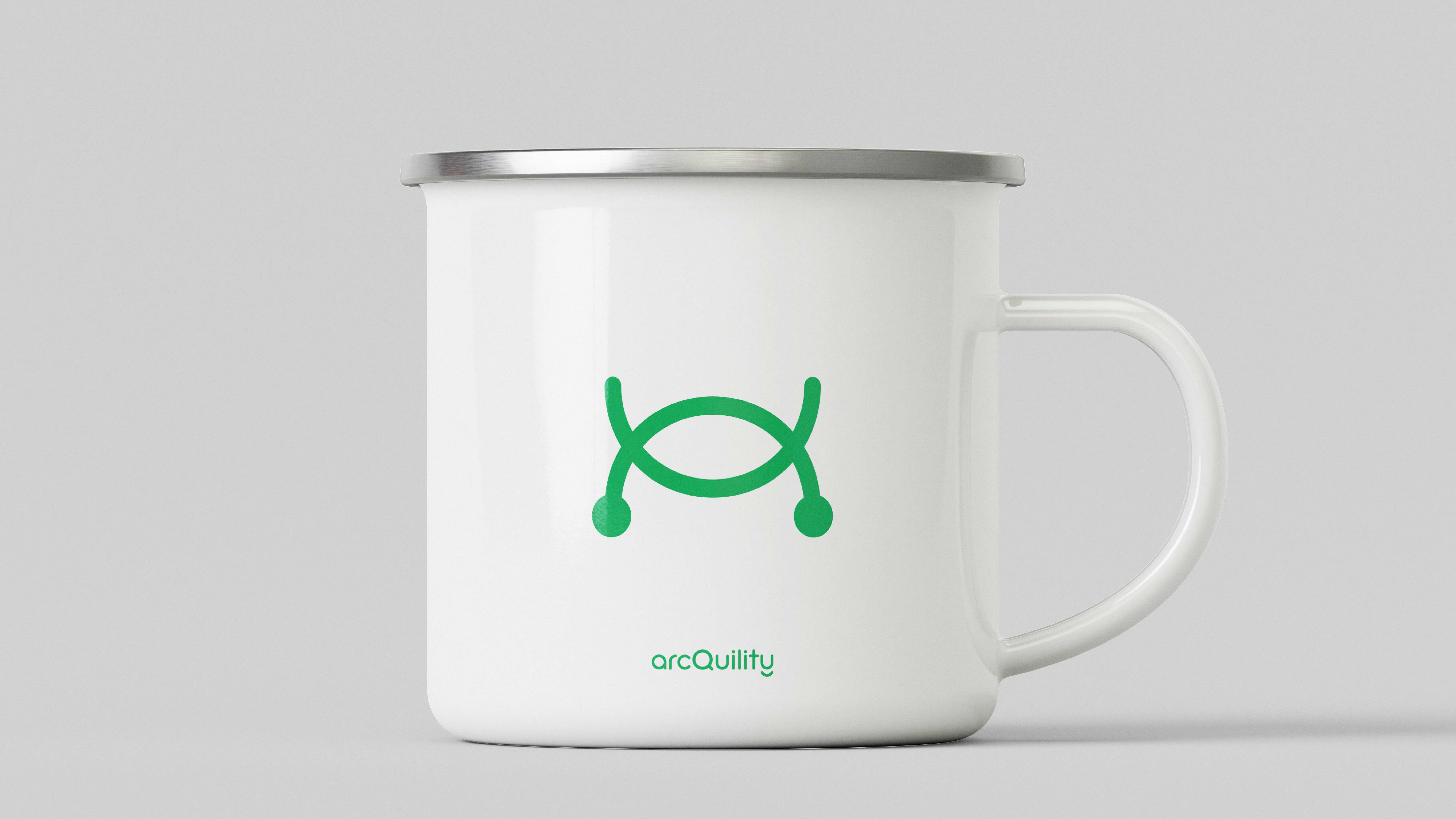
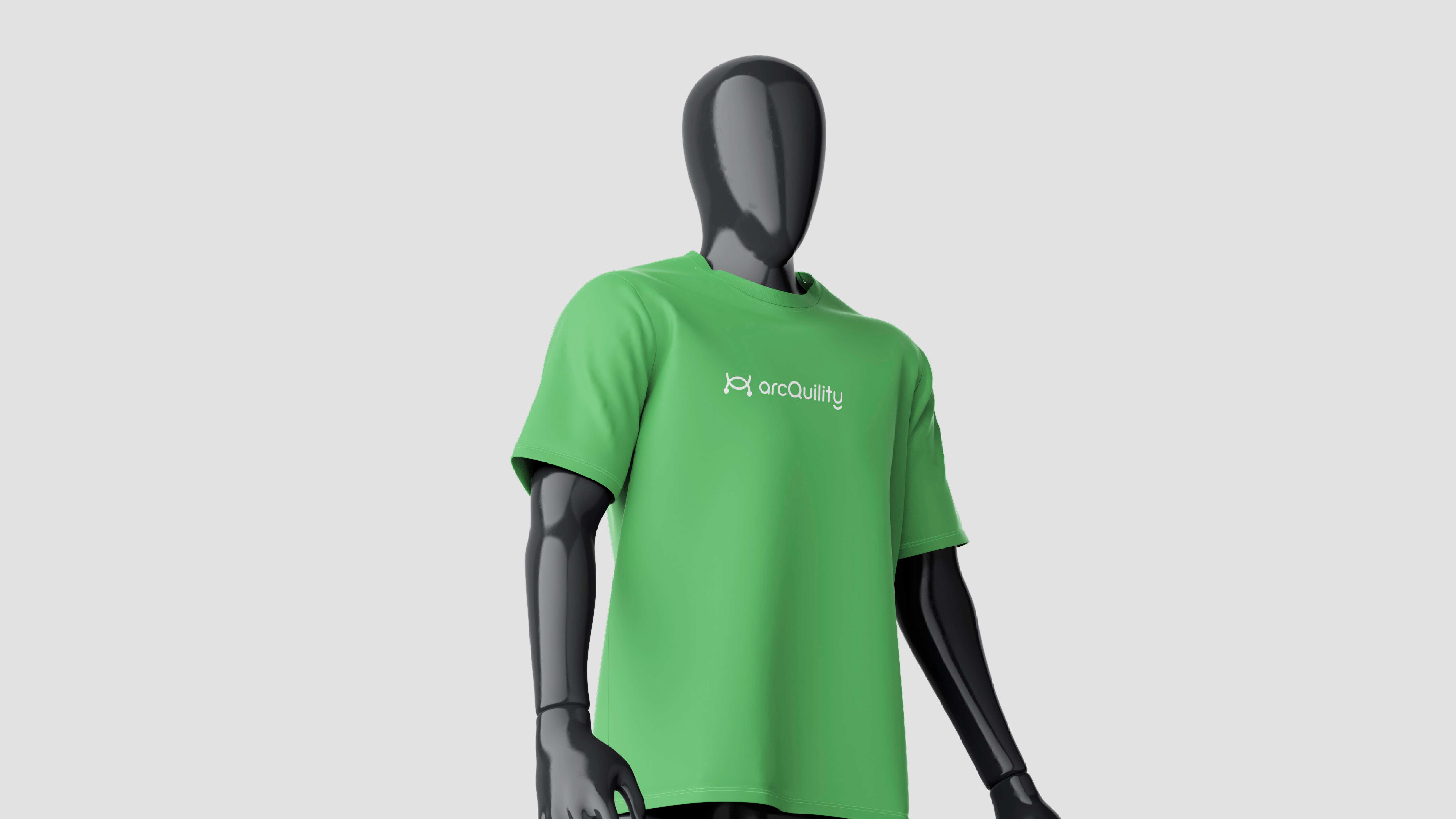

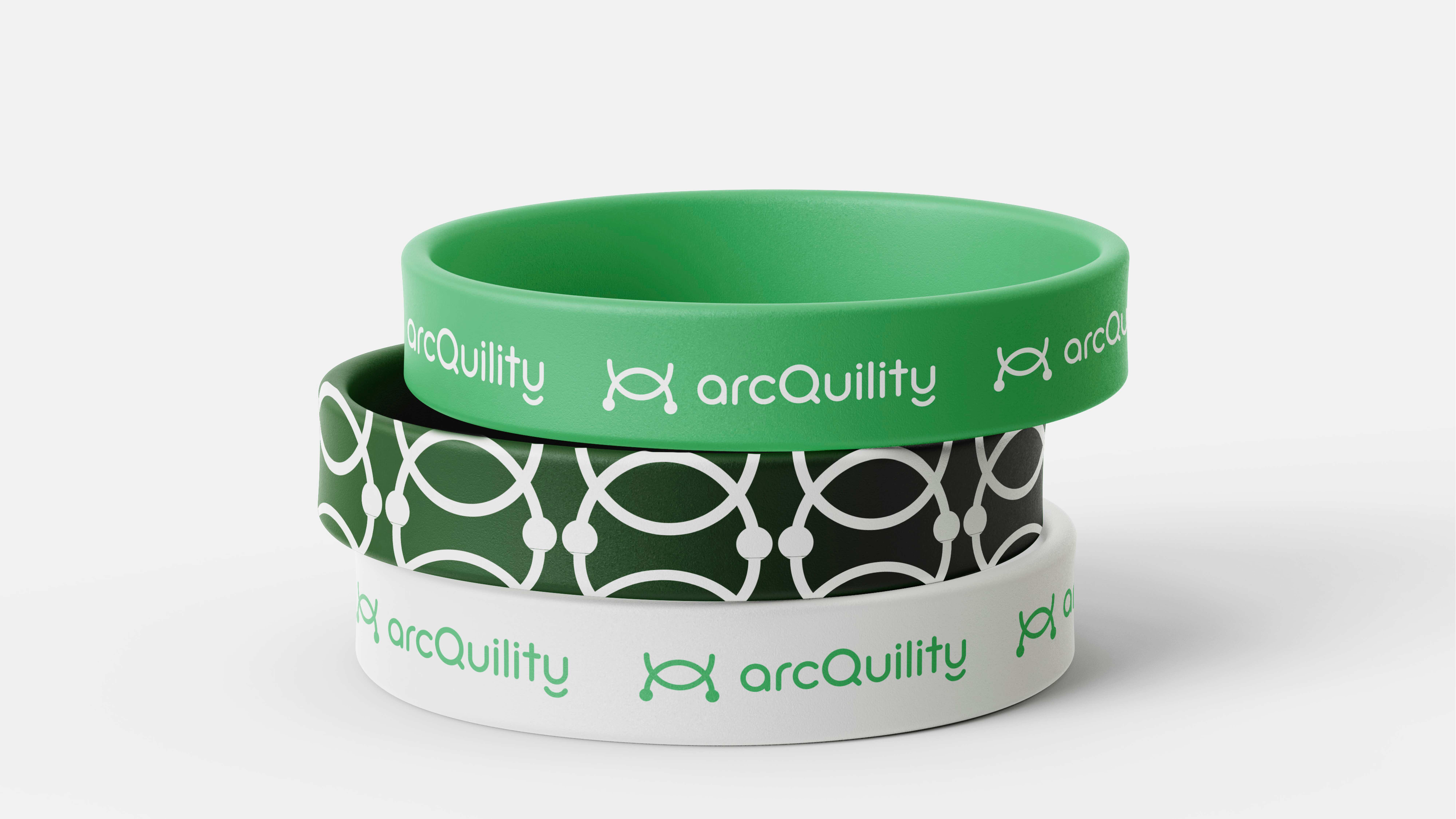
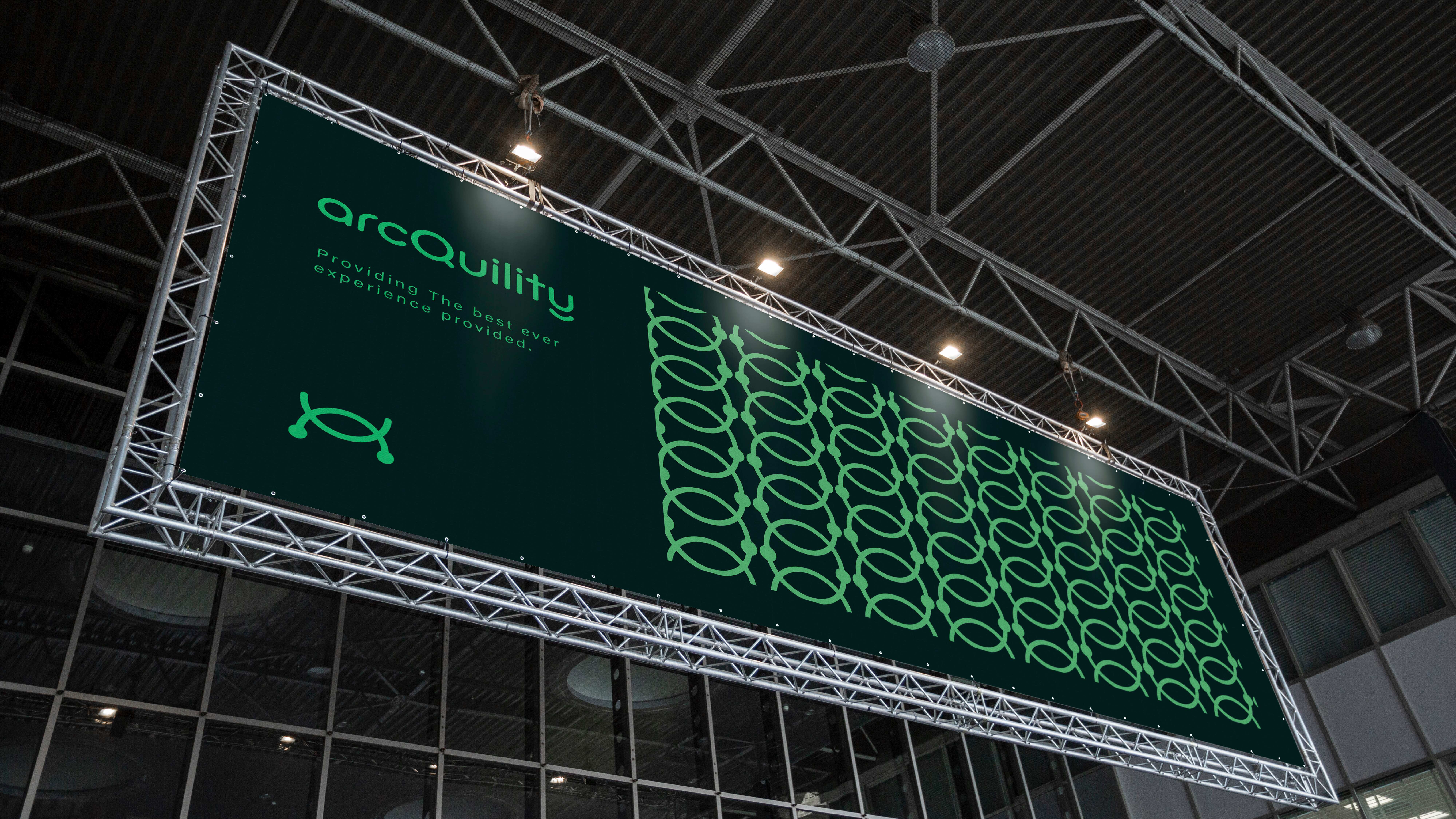
ArcQuility represents a perfect blend of calmness and precision, embodied through its clean logo and color palette. The logo features smooth curves that evoke a sense of tranquility, while the ending circles symbolize structure and connection. The brand's green color conveys sustainability and growth, while the dark background establishes a sense of sophistication and reliability. Designed with a combination of Goodly and Acumin fonts, ArcQuility’s visual identity resonates with both warmth and professionalism, making it ideal for companies in the tech and service industries. This brand is not just about visuals but also about creating a meaningful, modern experience for its audience.
Sector
- Real Estate
Discipline
- Brand Identity