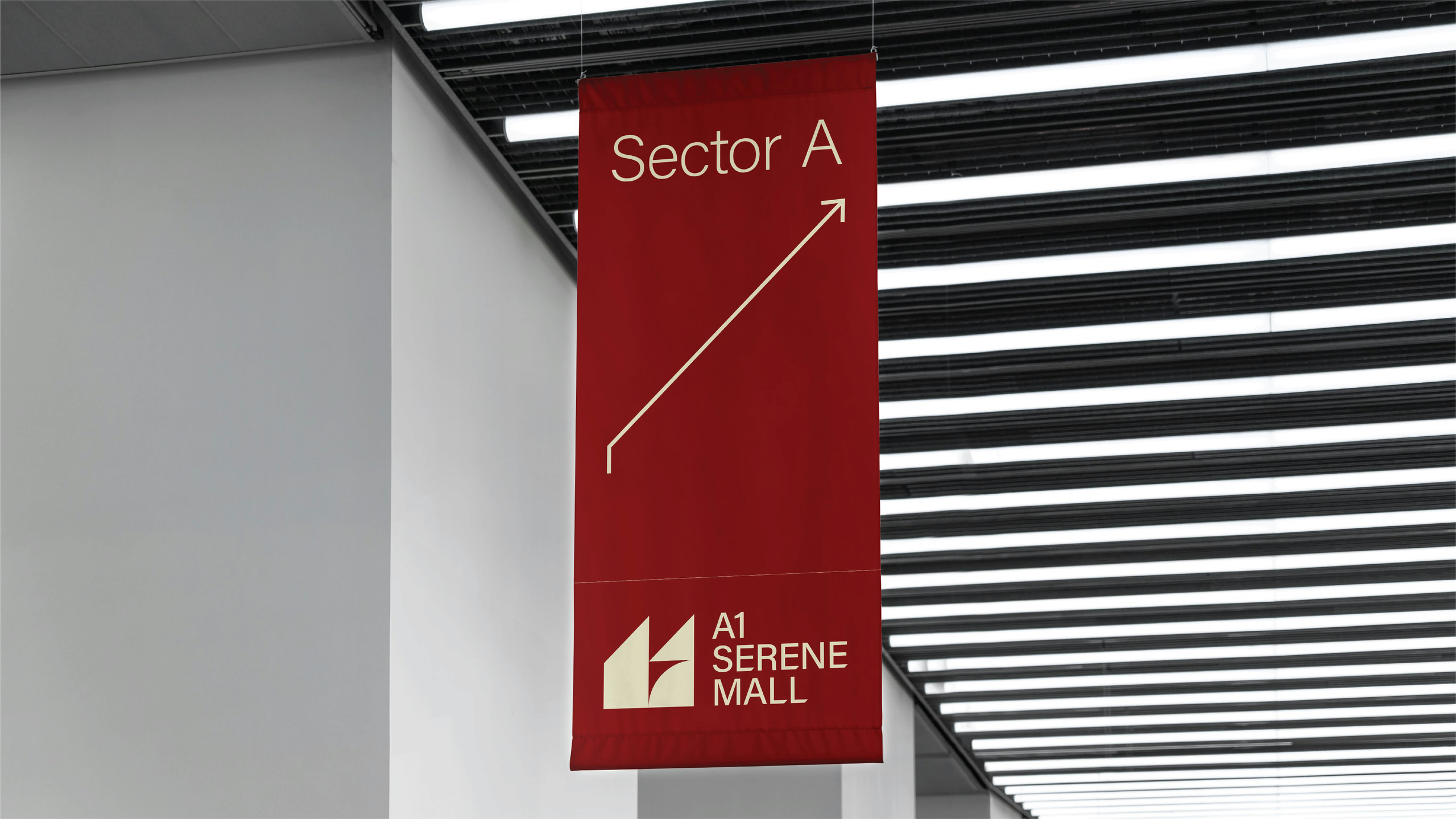
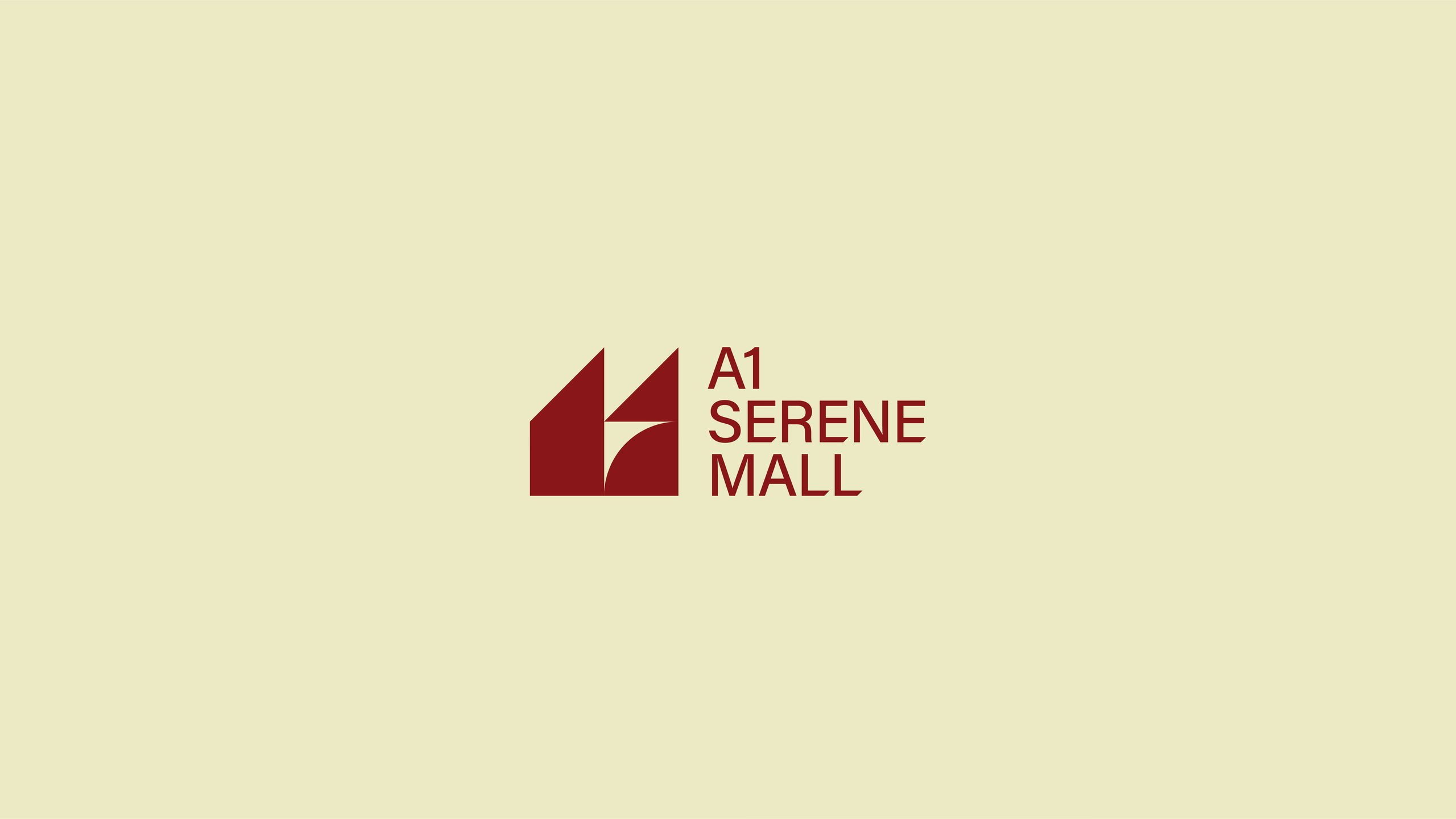
logo for A1 Serene Mall in Islamabad: two rising triangles on a steady base, drawn from the vertical lines of the building.
A1 Serene Mall is a new retail building in Islamabad. In February 2025 we designed a logo option for the mall, presented to the client through Archer Studio & Marketing Co.
The name already says most of it. In everyday speech A1 means the best, first class, top of the list. The logo did not need a slogan on top of that. It needed to carry the claim quietly, and look as solid as the building it stands for.
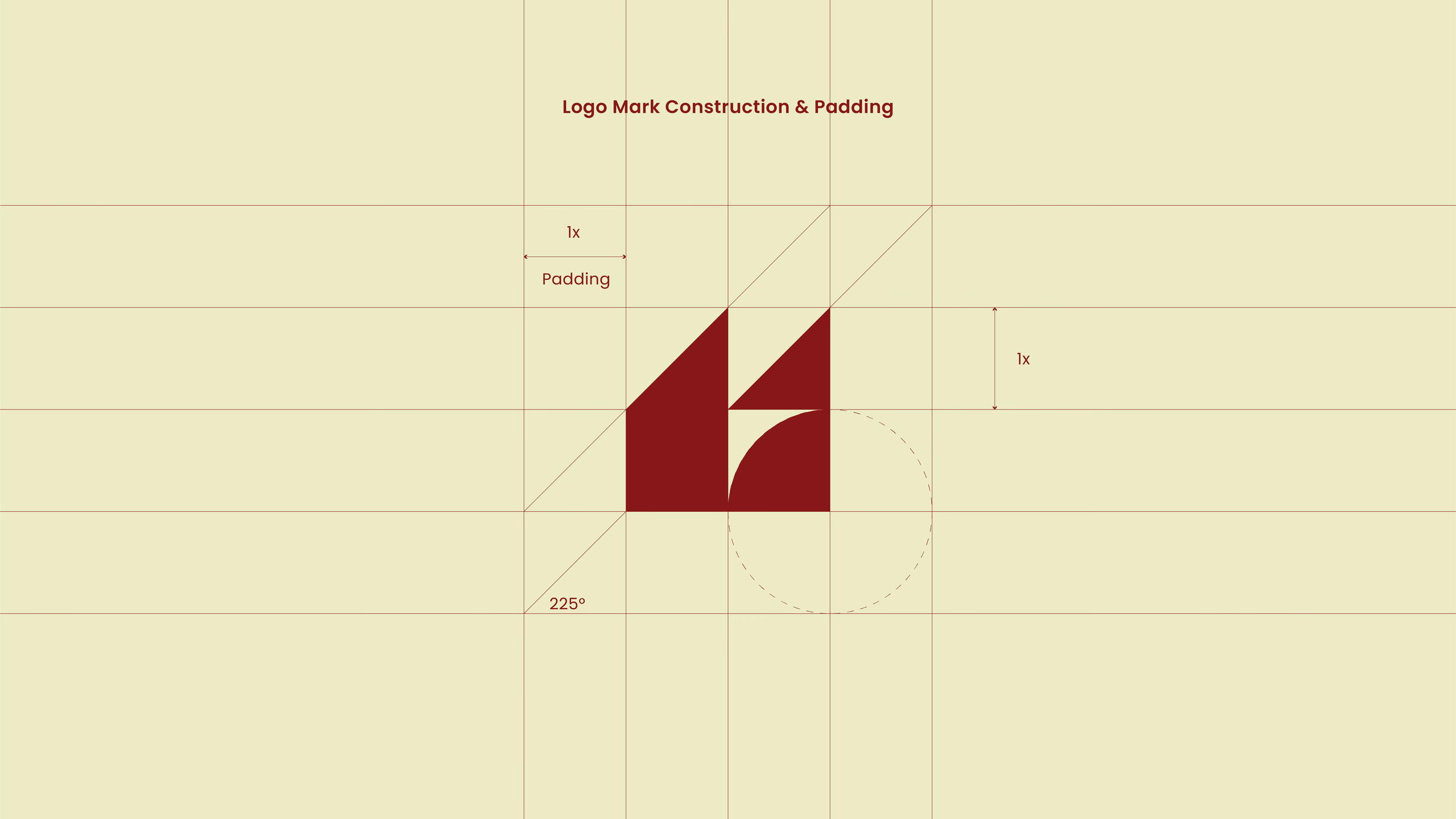
So we started with the building. Its lines are vertical and modern, and the mark follows them: two upward pointing triangles standing on a trapezoid base. Growth, elevation and stability, three ideas in three shapes. It began as a pencil sketch and was then rebuilt on a strict grid.
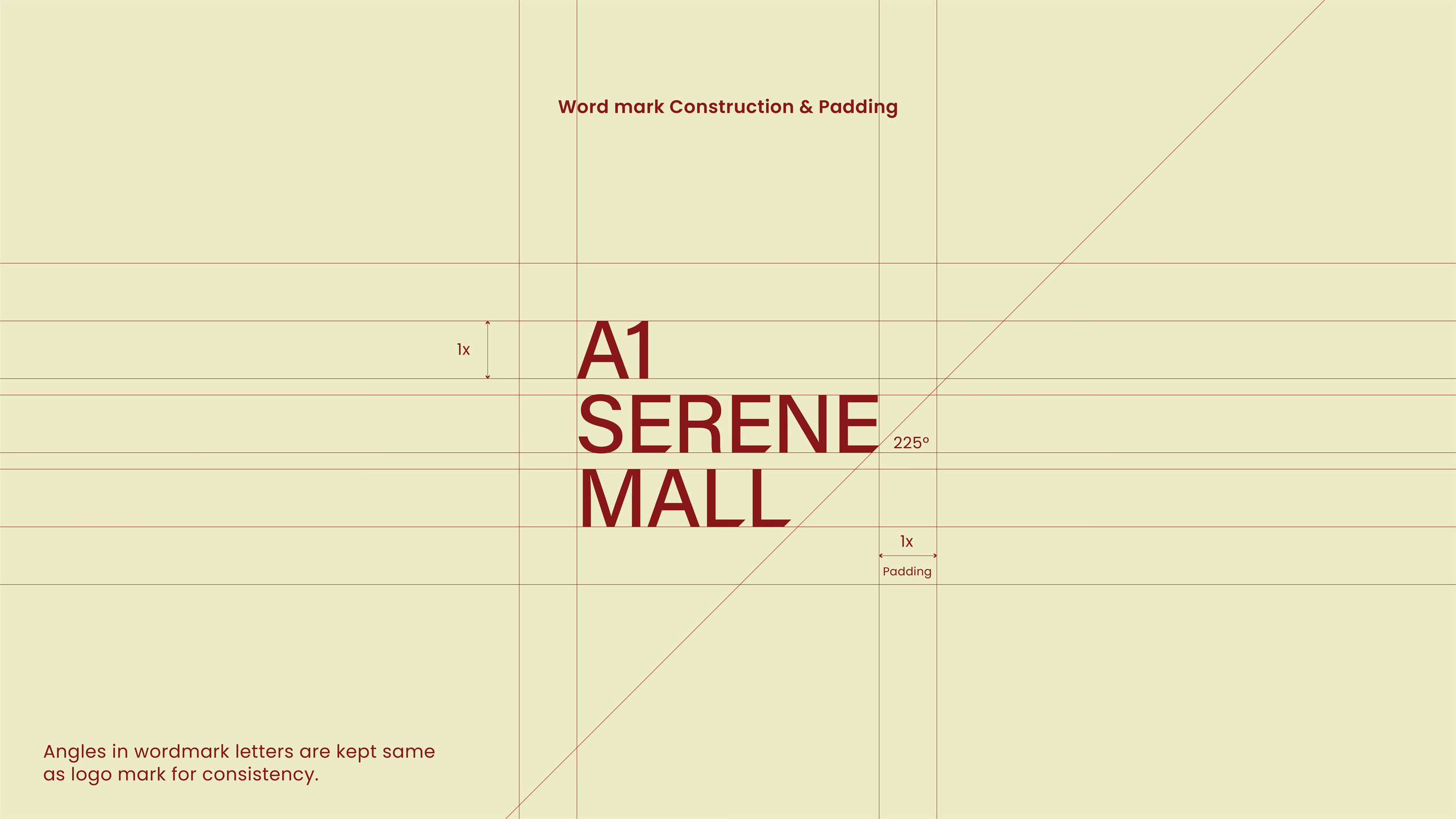
Every angle in the wordmark matches the angles of the mark, so the symbol and the name read as one drawing, not two parts placed side by side. The same construction sets the clear space around the logo, so it holds its shape on a business card and on the side of a building.
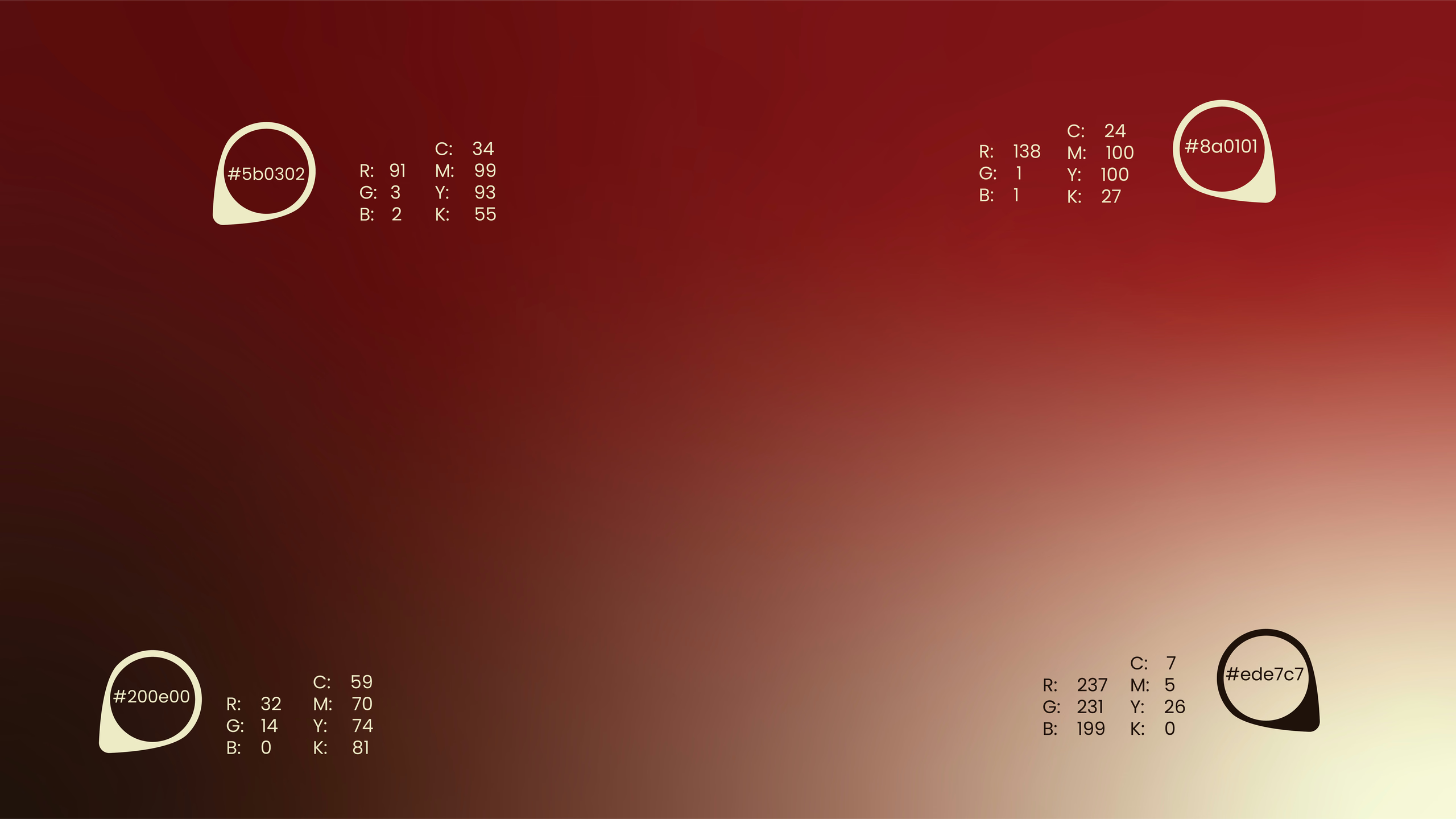
The palette is warm and confident: burgundy red, a deeper burgundy, dark chocolate and cream. In the guidelines, the size of each swatch shows how often that colour should be used.
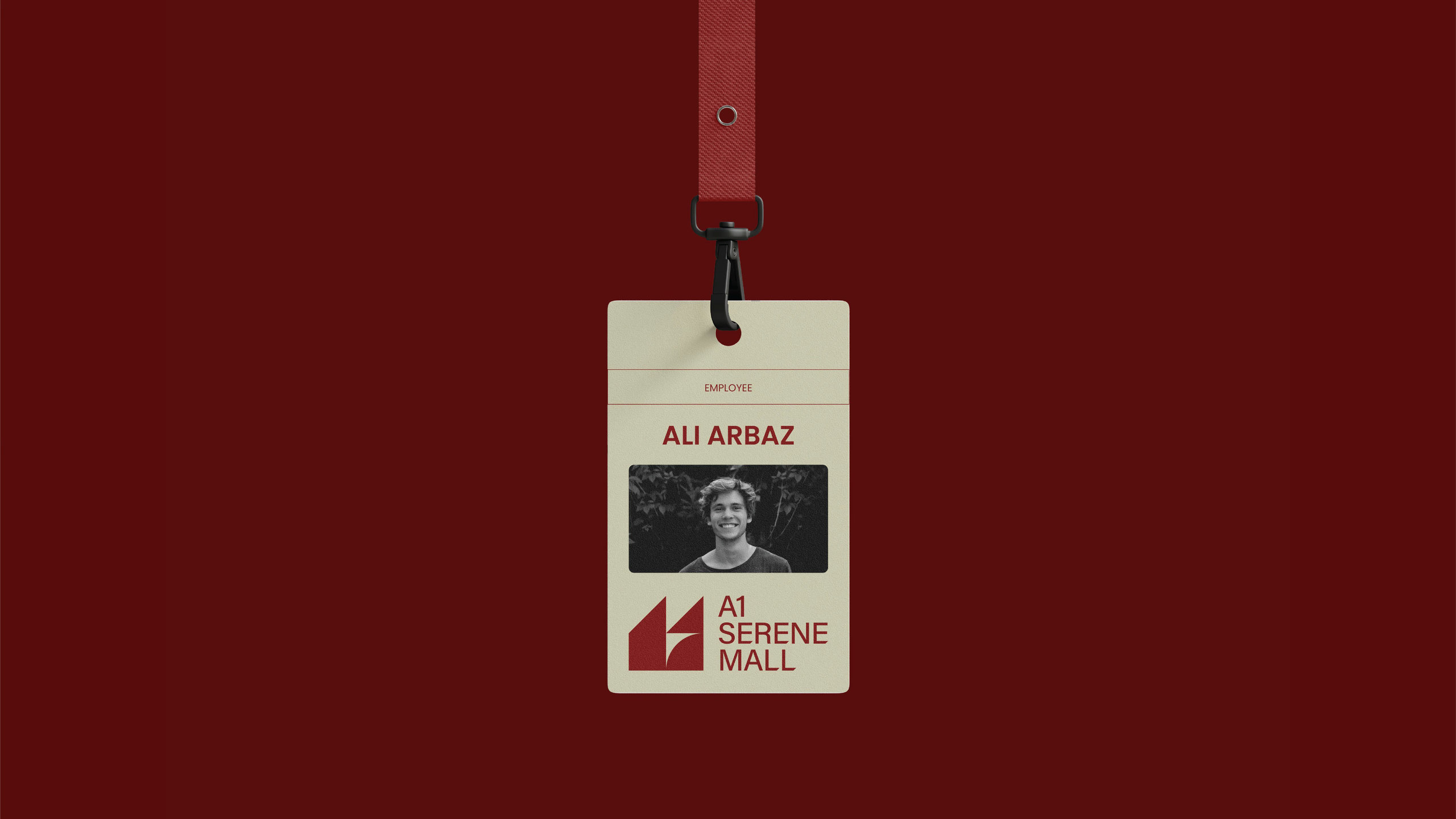
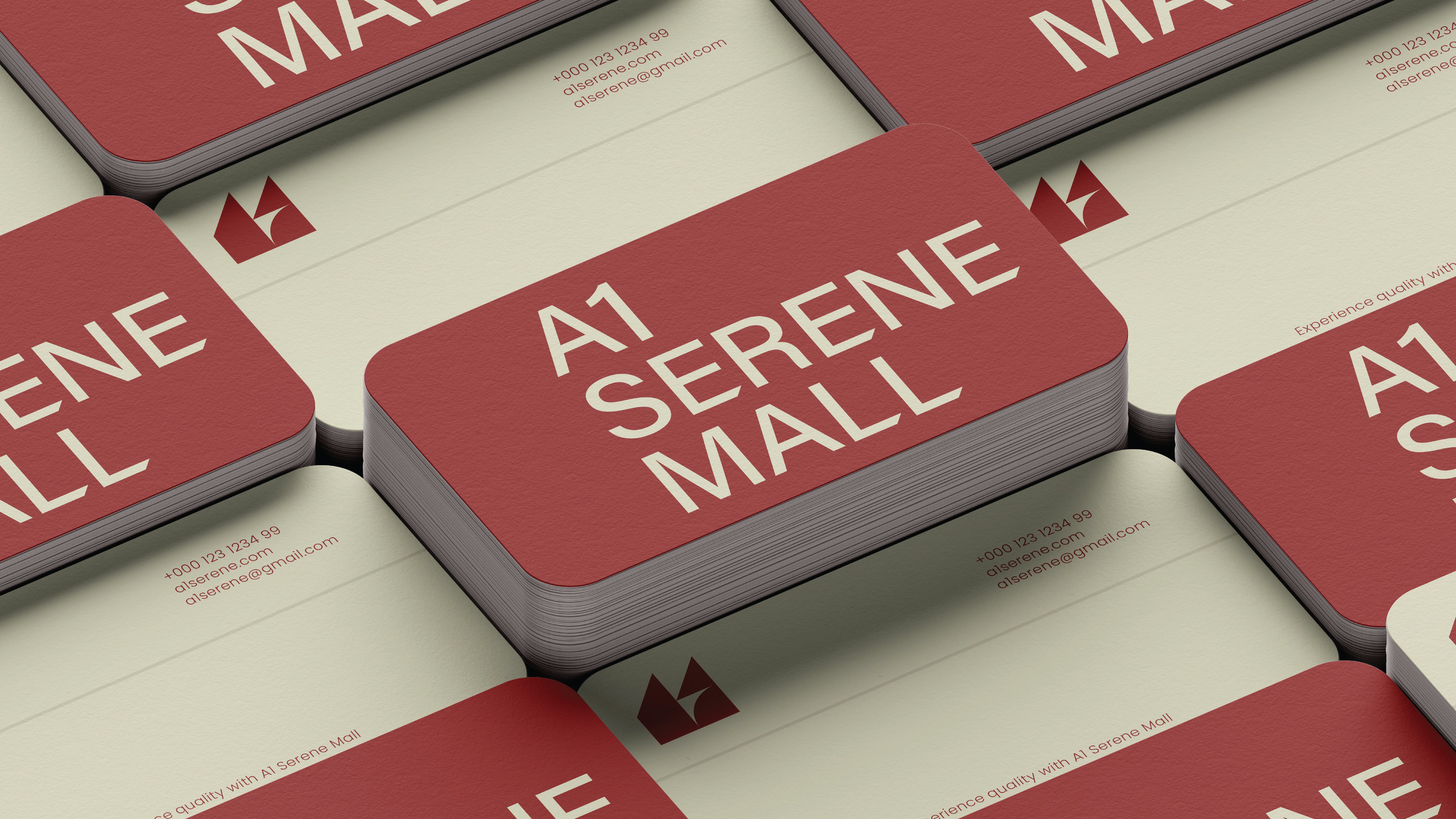
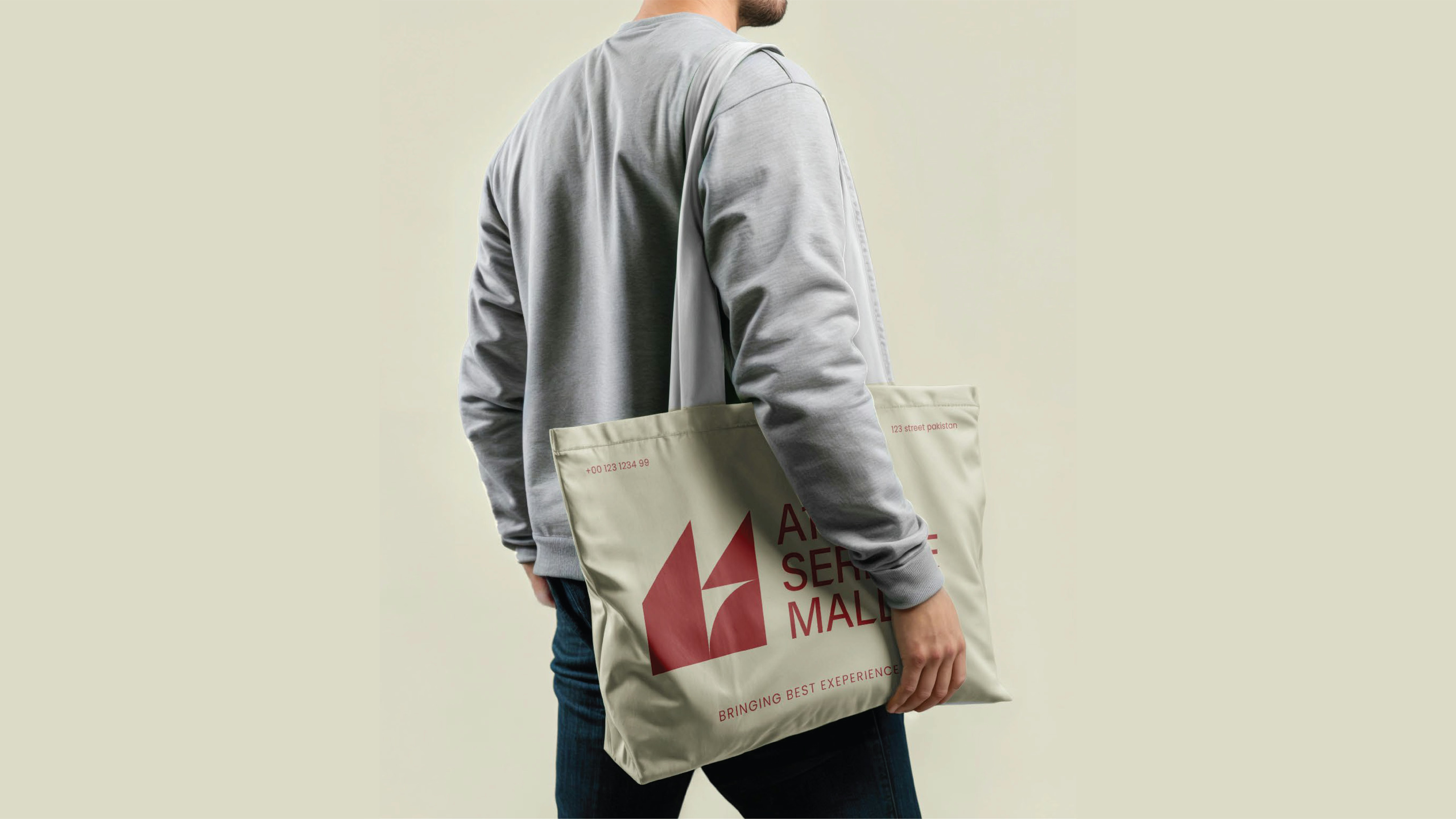
To test the option before anyone committed to it, we placed it on the things a mall actually lives on: a sale banner, a hanging sector sign, a shopping bag, business cards, letterhead and a staff ID card. All of these are presentation mockups.
Creative direction by Naseer Ud Din Ansari. Presented through Archer Studio & Marketing Co.